
Concept
Morrow
Designing the feeling before arrival.
Morrow is a fictional coastal inn and landscape project: rooms, a kitchen, a working garden, and a slow season. This study is a scenario. It asks how a hospitality brand can feel specific — material, local, and calm — without borrowing the visual dialect of every “quiet luxury” template.
Art direction · Editorial storytelling · Booking UX · Image systems
The scenario
Morrow sits on a working landscape rather than a decorated one. The kitchen cooks from what the grounds can give. The rooms are few. The brand cannot win on marble or a celebrity chef. It can win on the feeling of being received.
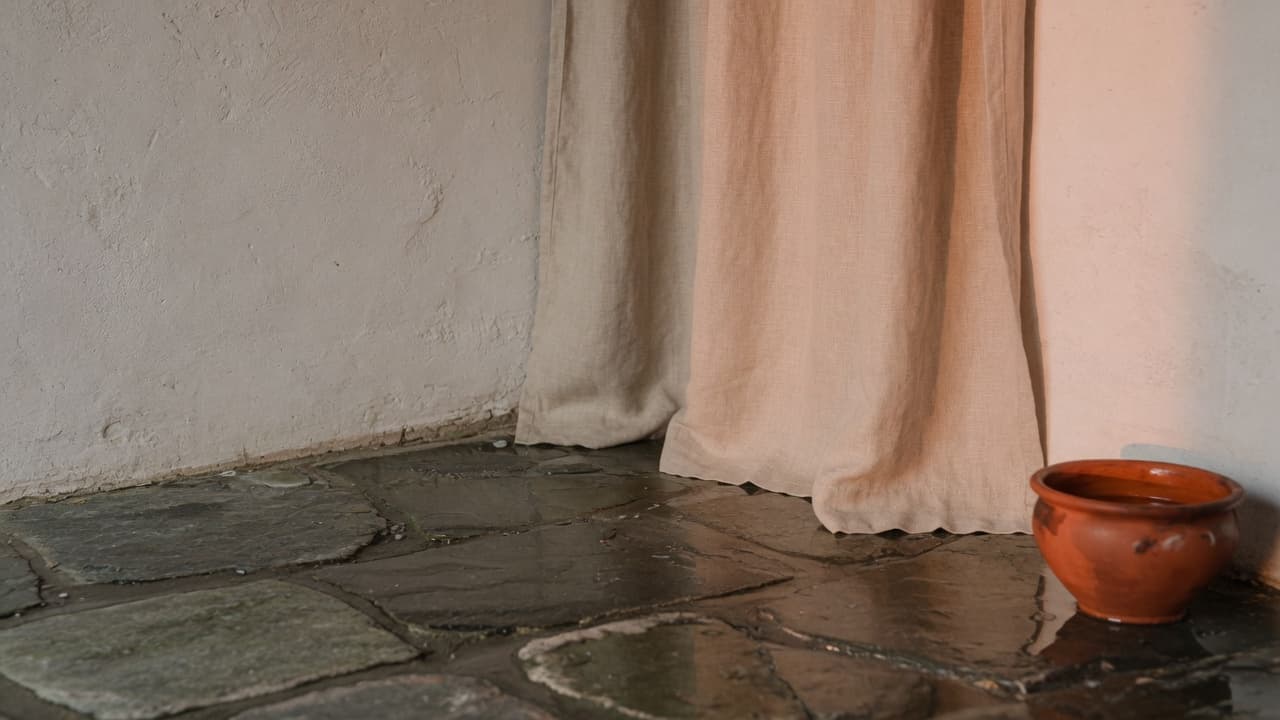
The study treats photography as material study — limewash, linen, wet stone, evening insects — and refuses lifestyle stock of people toasting in a pool.
The challenge
Hospitality brands often outsource their website’s emotional work to photography and their transactional work to an OTAs-shaped booking module. Guests feel the seam. Operators live with a CMS that cannot tell a seasonal story without a developer.
Luxury clichés are a trap: they photograph as expensive and remember as nothing.
Audience and objective
The guest is not hunting a deal. They are deciding whether this place will change the pace of a week. They will forgive fewer rooms. They will not forgive a site that feels generic, or a booking flow that panics them with dark patterns.
The operator needs seasonal narrative, room truth (what the window actually faces), and a booking path that does not leak into a different visual language.
Strategic reframe
Lead with arrival, not inventory. The first screen should feel like standing in the courtyard at the hour the property is most itself. Navigation is a house: Stay, Table, Grounds, House notes, Visit.
Availability is present, never shouted. When the visitor is ready, the booking path keeps type, material, and pacing. Confirmation should feel like a letter, not a receipt from a GDS.
Content architecture
Stories are modular and seasonal. A “now” layer (what is in the garden, what the weather is doing to the rooms) sits on top of durable pages (the house, the table, how to arrive).
Policies are rewritten as hospitality: when to come, how quiet the nights are, what children will find, what the landscape asks of guests. This is content strategy, not legal dumped in a footer.
Art direction
Warm paper, mineral ink, ember used like fired clay. Editorial serif for titles that can hold a long, specific phrase. Photography is cropped for tactility: a hinge, a table edge, weather on glass. Transitions dissolve like turning toward a window, not like a slider.
Three-dimensional light, if used, is atmospheric — dust, a volume of afternoon — and never a spinning villa.
Interaction and motion
Motion is slow on purpose and easy to refuse. Image reveals follow scroll, but the document remains a document. Reduced motion keeps the crops and type; it loses only the dissolves.
On touch devices, hover-dependent reveals become plainly tappable chapters. The booking module is large enough for a thumb and calm enough not to feel like commerce.
Design-system excerpt
A small set of editorial modules: arrival, material study, long letter, seasonal note, room plate, table menu, path to visit. Tokens name paper, ink, clay, moss, dusk. Imagery has required crops for 4:5, 16:9, and a square mark, because hospitality CMS chaos usually starts with one hero size.
Responsive treatment
Mobile is the likely first visit, often in a moment of wanting. Type is allowed to be large but not theatrical. The booking summary sticks without covering the photograph that is doing the emotional work. Landscape orientation is composed, not spilled.
Accessibility and performance
Warm palettes fail contrast when they become beige on cream. Ink is dark enough; ember is used for emphasis, not body text. Alt text describes material and place, not “beautiful interior.”
Images are the performance risk. The system assumes AVIF/WebP, explicit dimensions, and a lazy policy that still prioritizes the first arrival frame. No carousels autoplay.
What this study demonstrates
This study demonstrates how hospitality can be differentiated through editorial pacing, material honesty, and a booking flow that belongs to the same story. It is a design hypothesis for atmosphere and usability, not a claim about occupancy or revenue. No property commissioned it.