
Champions BJJ · Brand and website transformation
Building a digital home worthy of the Champions name.
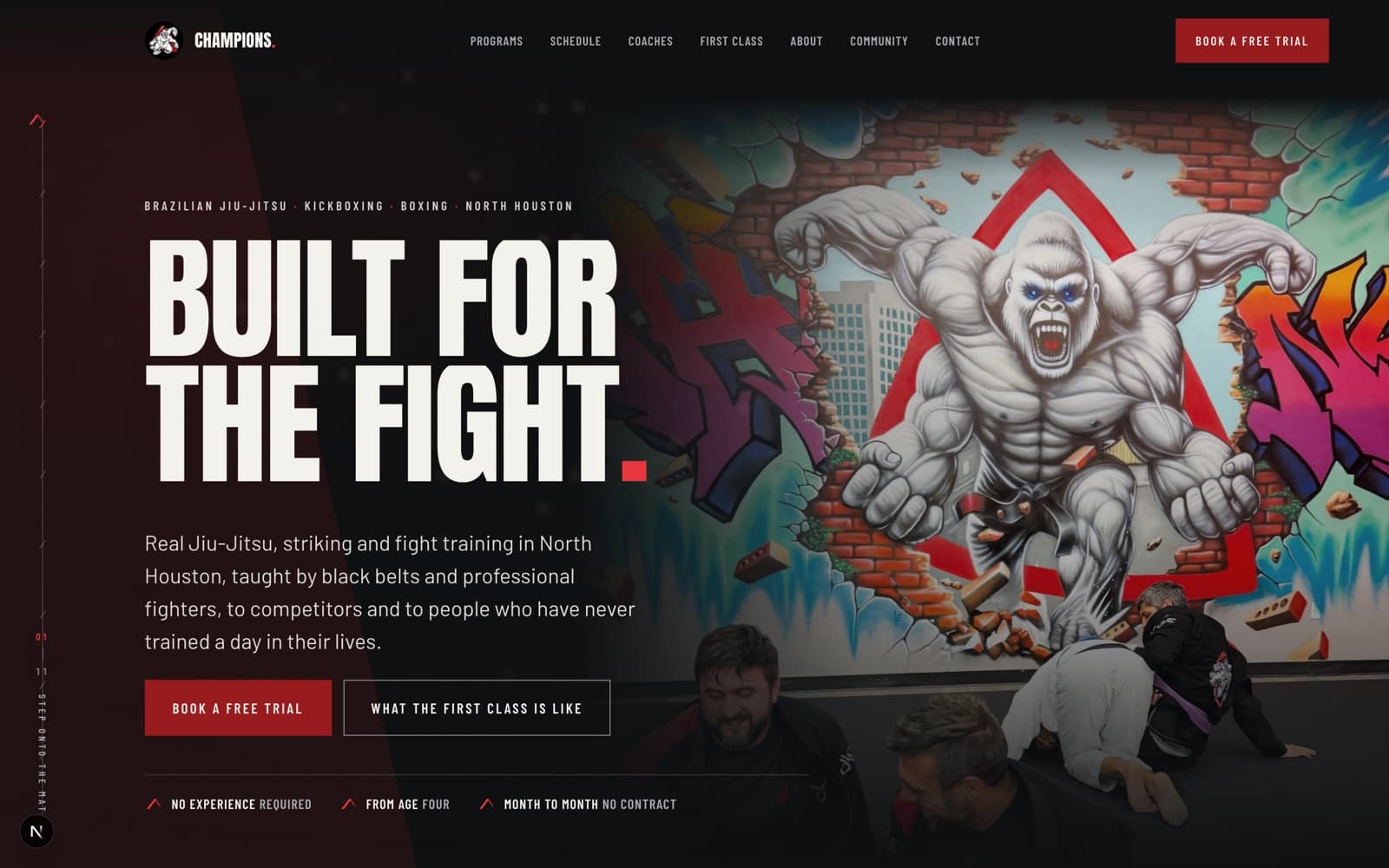
Raw fight-gym energy becomes a focused recruitment experience: one cohesive identity, clearer audience pathways, stronger proof, legible programs and schedules, and a direct route from curiosity to a first class.
- Client
- Champions BJJ
- Sector
- Martial arts academy
- Where
- North Houston, Texas
- Engagement
- Brand and website transformation
- Year
- 2026
- Services
- Brand audit · Creative direction · Audience journey design · Program and schedule systems · Motion language · Front-end build · Trial-booking flow
- Built with
- Next.js · TypeScript · Tailwind · GSAP · WebGL · Zod-validated content
The gap
Champions has what most gyms are missing: black belts and professional fighters who actually coach, a community that stays, programs from age four upward, and a room with real photography in it.
What it did not have was a website that agreed with itself. The homepage promised a fight brand. The interior pages delivered a template. Between those two claims, a first-time visitor had to do the work of deciding whether this place was for them.
The rebuild does not manufacture intensity. Champions already has that. It shapes the intensity into something a nervous beginner, a parent, and a competitor can each read correctly.
Before — one academy, two websites
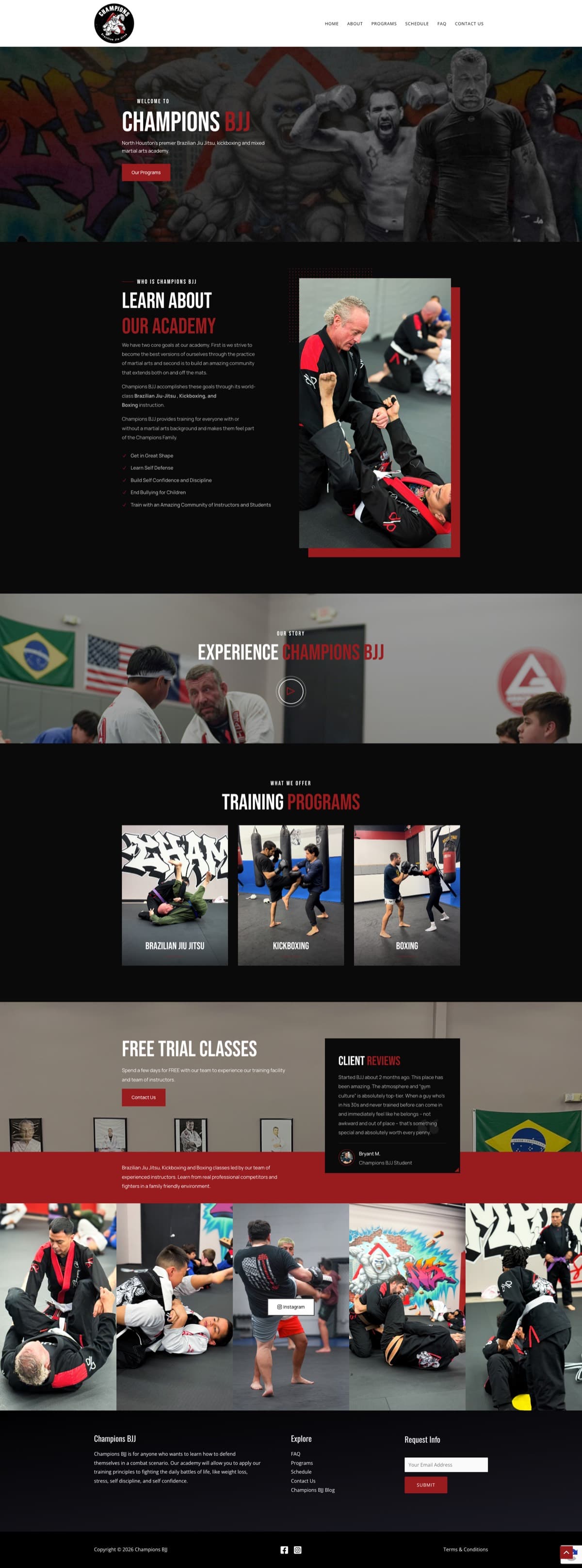
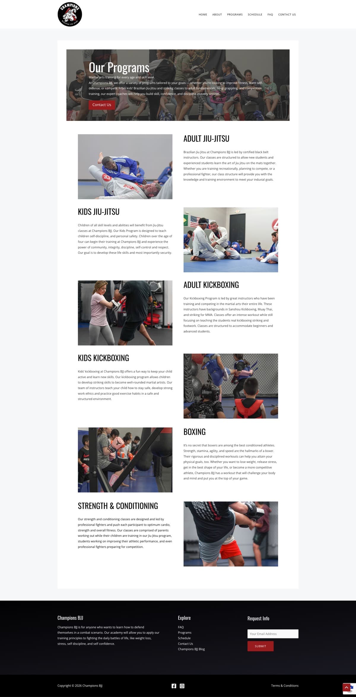
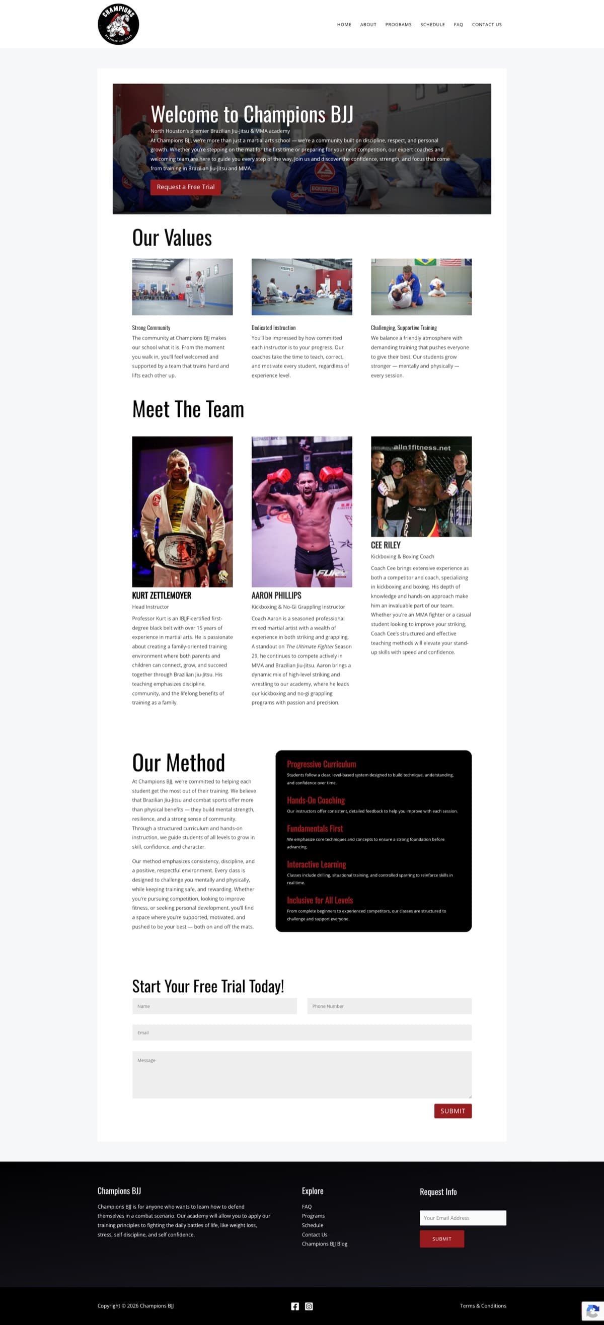
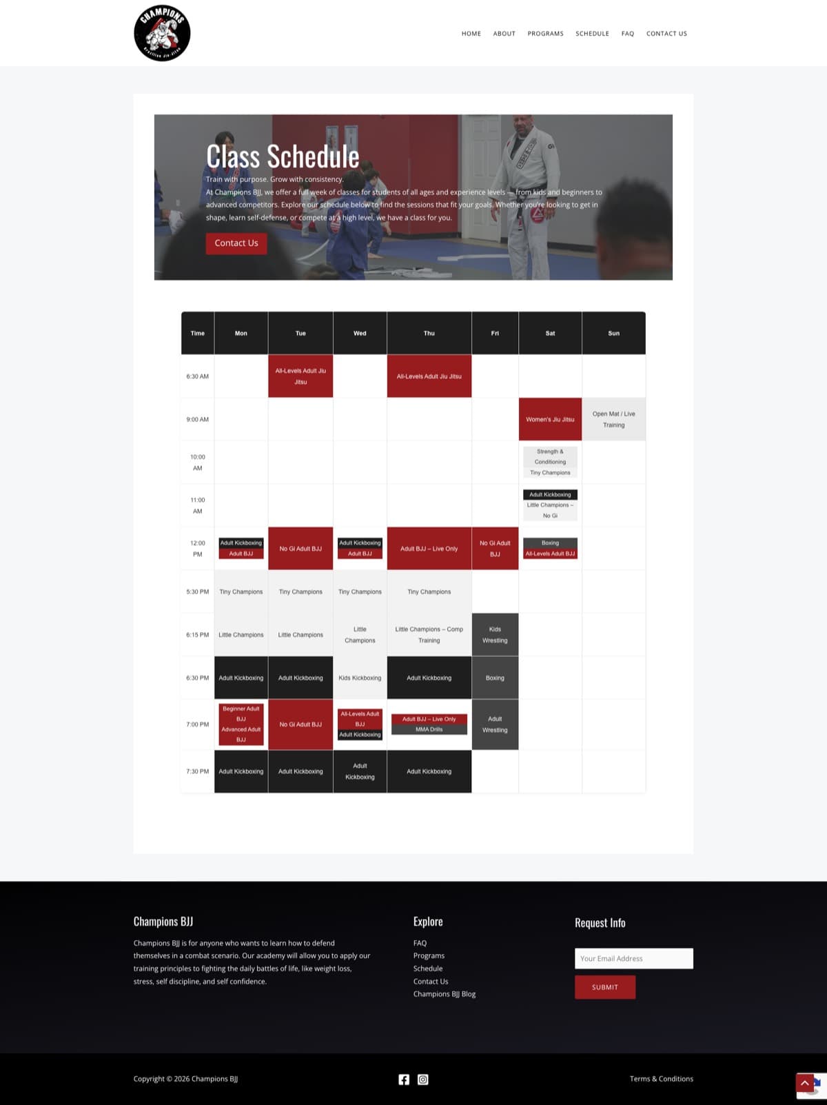
Energetic and information-rich, but visually fragmented. Competing design systems, dense content, a difficult schedule and scattered calls to action made it harder for a prospective student to understand where they fit.
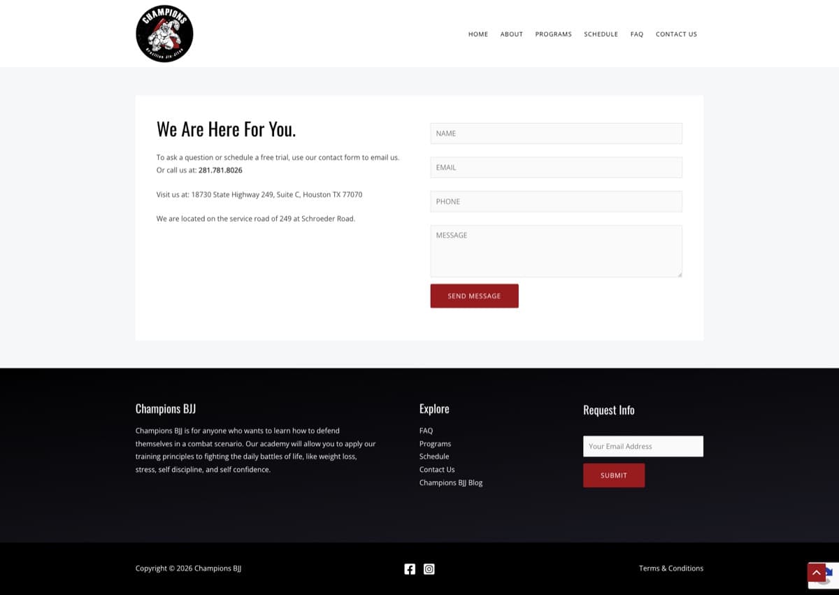
Six desktop captures of gbchampions.com, taken 2 September 2026. The homepage and an interior page shown together make the fragmentation argument better than any description of it.
These findings cover visual design, content hierarchy, navigation, schedule presentation and visible conversion paths. Mobile behaviour, source accessibility, technical SEO, form delivery and performance were not independently tested and are not claimed.
 Before
 Before
 Before
 Before
 Before
What the captures substantiate
Eight findings, each visible in the captures. They are problems of structure and hierarchy, not of effort — there is a great deal of real material on the current site.
01
One academy, two visual systems
The homepage ran dark, cinematic red-and-black with large photography. Most interior pages switched to light grey backgrounds and narrow white containers. The change reads as two different businesses.
02
No singular next step
Our Programs, Contact Us, Request a Free Trial, Free Trial Classes and several generic forms all pointed at roughly the same goal without forming one low-friction path.
03
Schedule overload
The weekly schedule compressed every class type, age and level into a spreadsheet grid with small labels and no filtering. It answers “what exists” but not “which class is right for me, and when can I try it?”
04
Different audiences, same journey
A parent evaluating safety needs different reassurance than a competitor evaluating coaching lineage. The old site listed programs; it did not route anyone.
05
Intensity without reassurance
The fighter montage and graffiti backdrop landed hard. For a nervous beginner or a parent, impact without structure reads as intimidation.
06
Proof buried in paragraphs
Coach credentials, values and methodology were all present, spread across long alternating blocks and narrow columns that made the strongest material laborious to find.
07
Programs described, not comparable
Adult and kids' jiu-jitsu, kickboxing, boxing and strength training were each explained, but nothing let a visitor compare age range, level, goals, gear or next available class.
08
Generic lead capture
Forms collected a name and a message. They did not help anyone choose a program, state their experience, or reserve a specific trial time — leaving that work with the academy.
The strategic idea
One brand world, four audiences, one next step.
The dark, cinematic system from the old homepage was the right instinct — so it becomes the whole site rather than its front door. Interior pages inherit the same field, type and photography treatment instead of dropping into a stock layout.
Audience routing sits above program listing. Adults new to training, parents, experienced grapplers and fitness-focused students each get a legible entry point, and each lands on the same single action: book a free trial.
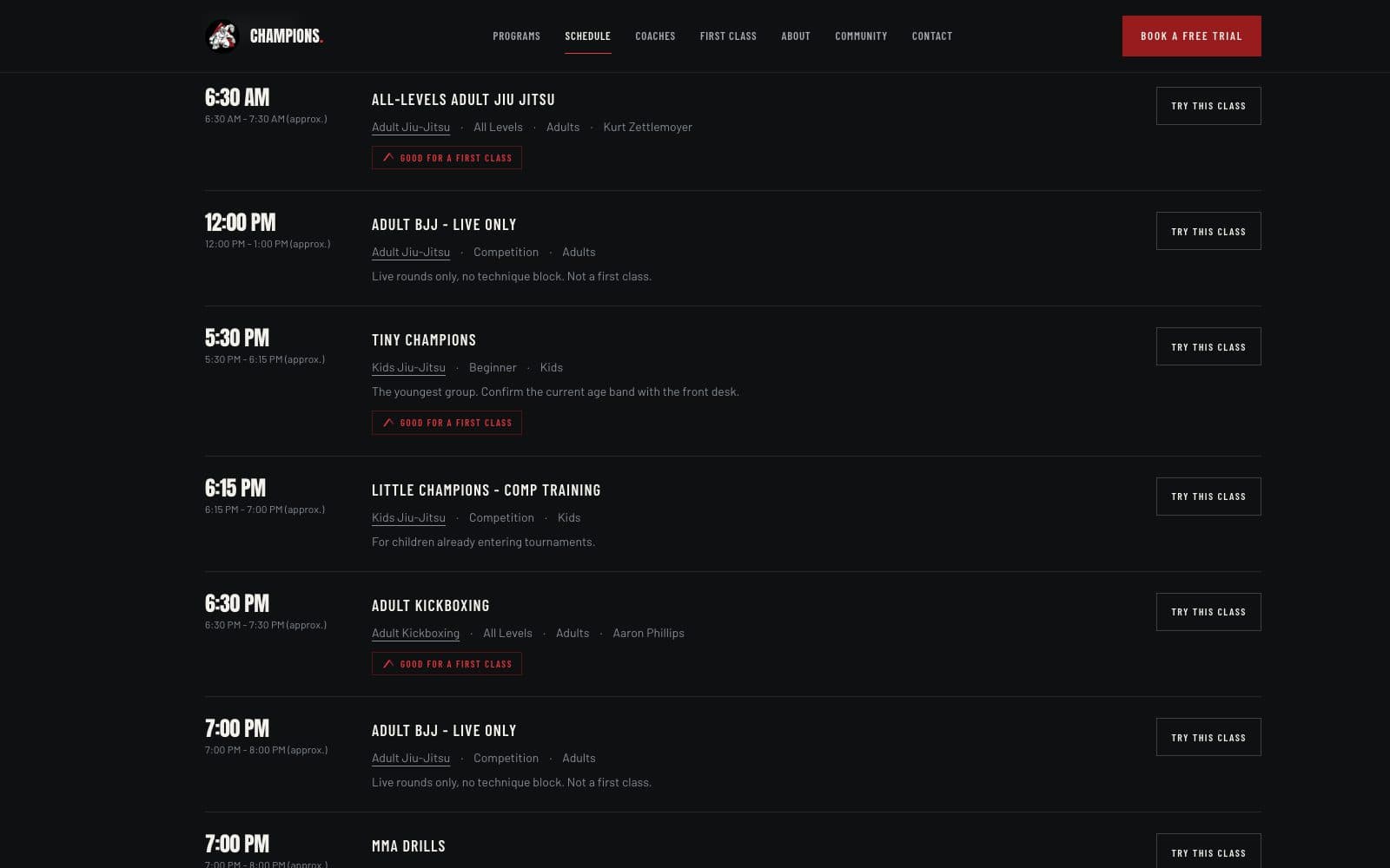
The schedule stops being a spreadsheet and becomes a filter. Choose who is training and what they want, and the week reduces to the classes that answer it.
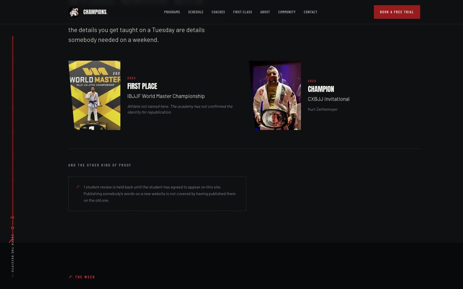
Credibility moves forward. Coaching lineage, competition record and the honest description of what a first class is actually like are placed where the hesitation happens, not three scrolls into an About page.
After direction — one identity, one path onto the mat
A unified, high-impact academy experience that balances toughness with belonging, makes every program easier to compare, and guides each visitor toward the right first class.
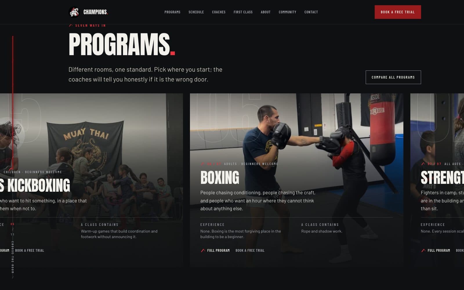
The redesign has not launched, so it is shown beside the current public site rather than presented as a replacement for it. Everything labelled “in development” is exactly that.
One identity, applied everywhere
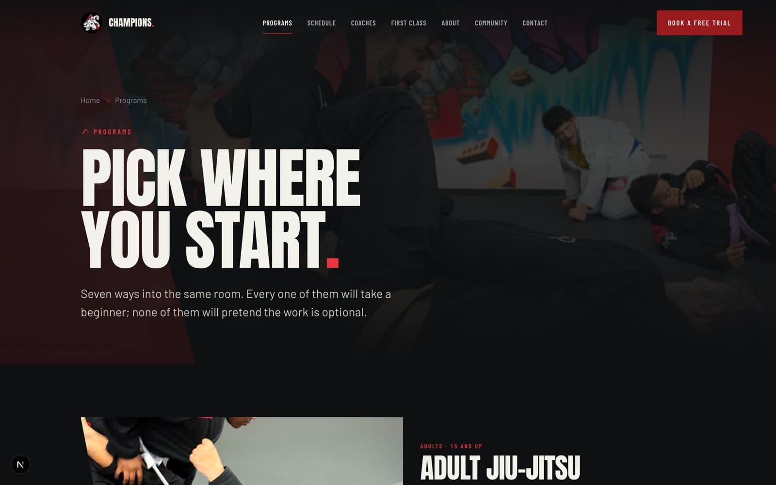
The redesign keeps the red, the black and the mural, and stops apologising for them on interior pages. Condensed display type is used as impact rather than as body copy, so the tone stays hard while the reading stays easy.
The homepage states what the academy is and who it teaches in the first two lines: real jiu-jitsu, striking and fight training, taught by black belts and professional fighters, to competitors and to people who have never trained a day in their lives. Both audiences are named on purpose.
In development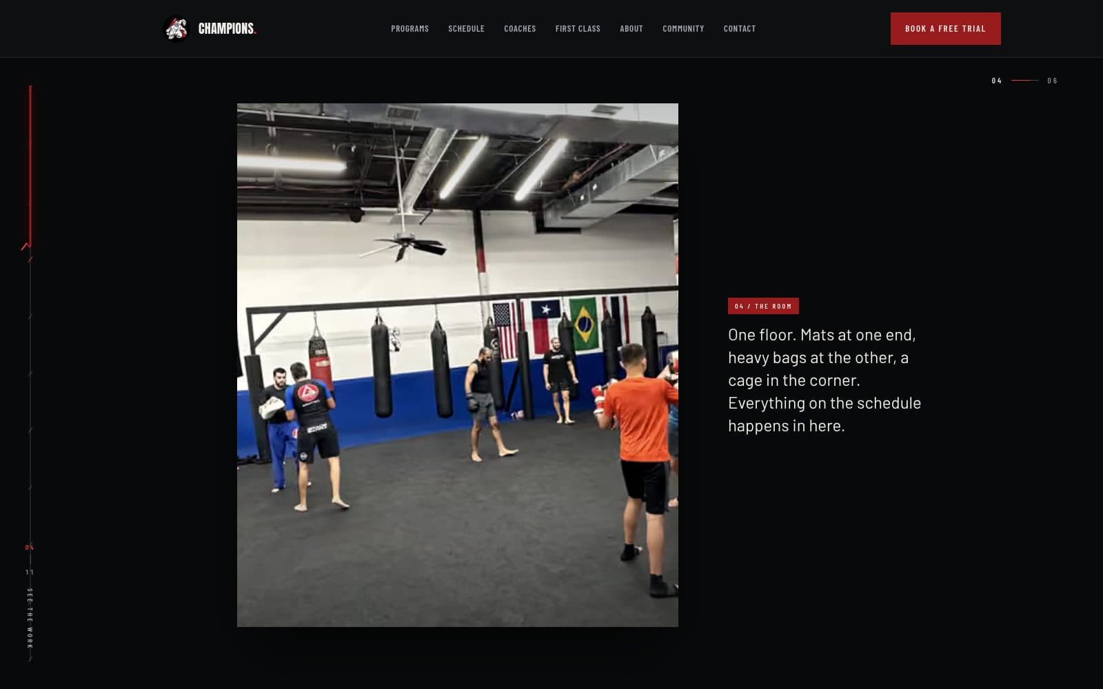 In development
 In development
 In development
Programs you can compare
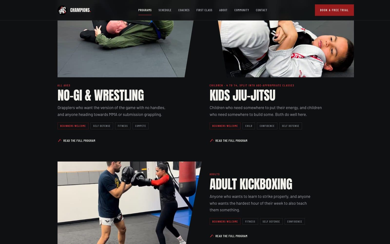
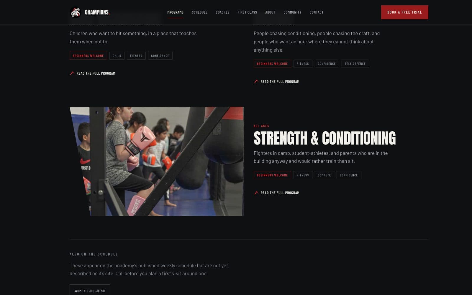
Each program states its age range, experience level, what it is for, what to bring and when it next runs. The comparison a prospective student was doing in their head is done on the page instead.
 In development
 In development
 In development
The schedule, filtered
The spreadsheet becomes a question. Who is training, and what do they want? The week collapses to the classes that answer it, and every result carries the one action that matters.
The mobile schedule is not a scaled-down grid. It is a different composition of the same data, because a phone is where most people check whether the 6pm class works.
 In development
 In development
 In development
One route onto the mat
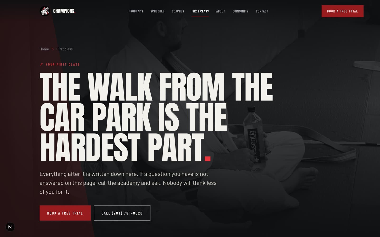
Every path converges on a single, honest page: what the first class is actually like. What to wear, what happens when you walk in, whether anyone will make you spar, and how to book one.
That page exists because the hesitation is not about price. It is about walking into a room full of people who already know each other.
 In development
Proof, moved forward
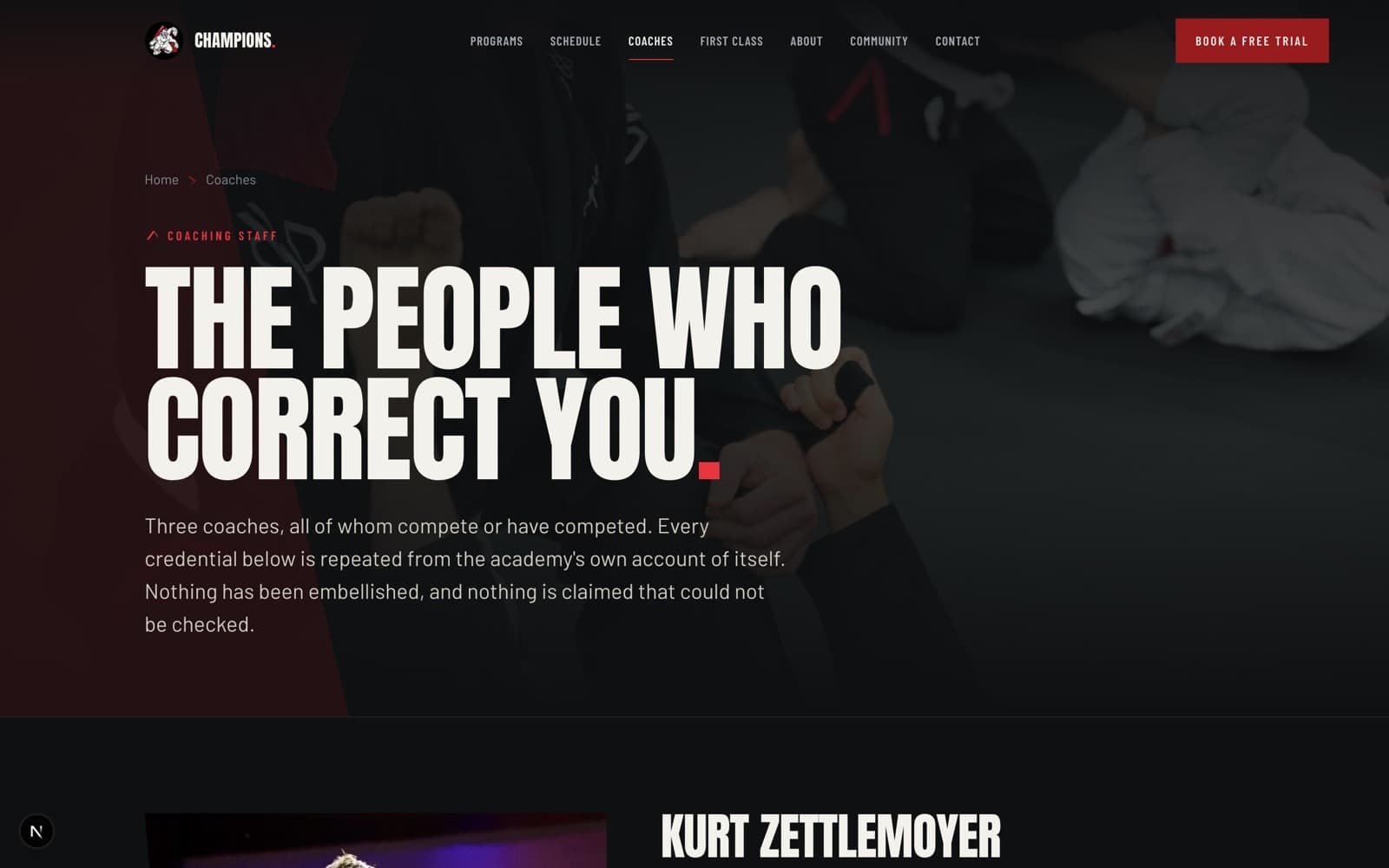
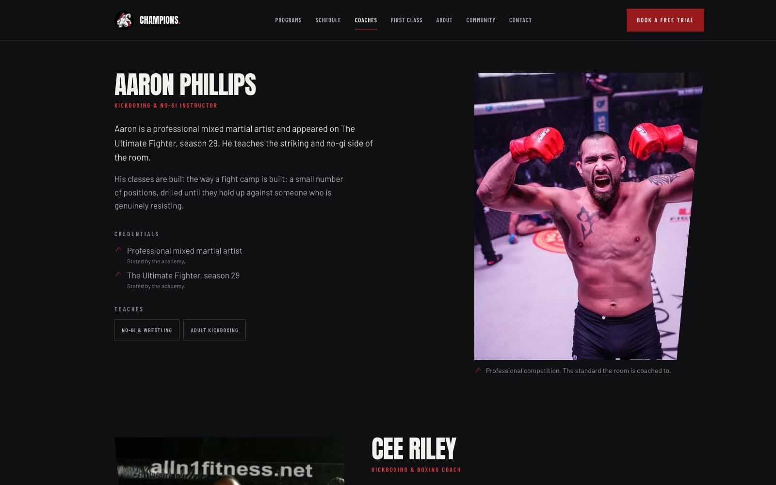
Coaching lineage and competition experience stop being biography and start being reassurance, placed at the moment a visitor is deciding whether these people can be trusted with their kid, their knees, or their next competition.
 In development
 In development
Intended outcomes — not results
What this is designed to change
This site has not launched, so there are no results to report. These are the outcomes the rebuild is designed for. They will be replaced with measured figures only if and when the academy shares analytics after launch.
- Reduce the effort required to find an appropriate class.
- Make free-trial registration a single, direct path rather than five competing buttons.
- Improve clarity across programs and the weekly schedule.
- Balance competitive credibility with beginner accessibility.
- Hold one consistent brand experience across every page.
Champions never needed to be made tougher. It needed the toughness to be organised — so that the person most likely to walk through the door can tell it was meant for them.
Still open
- Launch date and final domain handover.
- Owner sign-off on coach biographies and competition records before publication.
- Post-launch analytics, if the academy chooses to share them.
Is your site doing the same thing to you?
Champions BJJ is mid-rebuild. If you recognise the problem, that is where yours would start too.
Start a transformation