
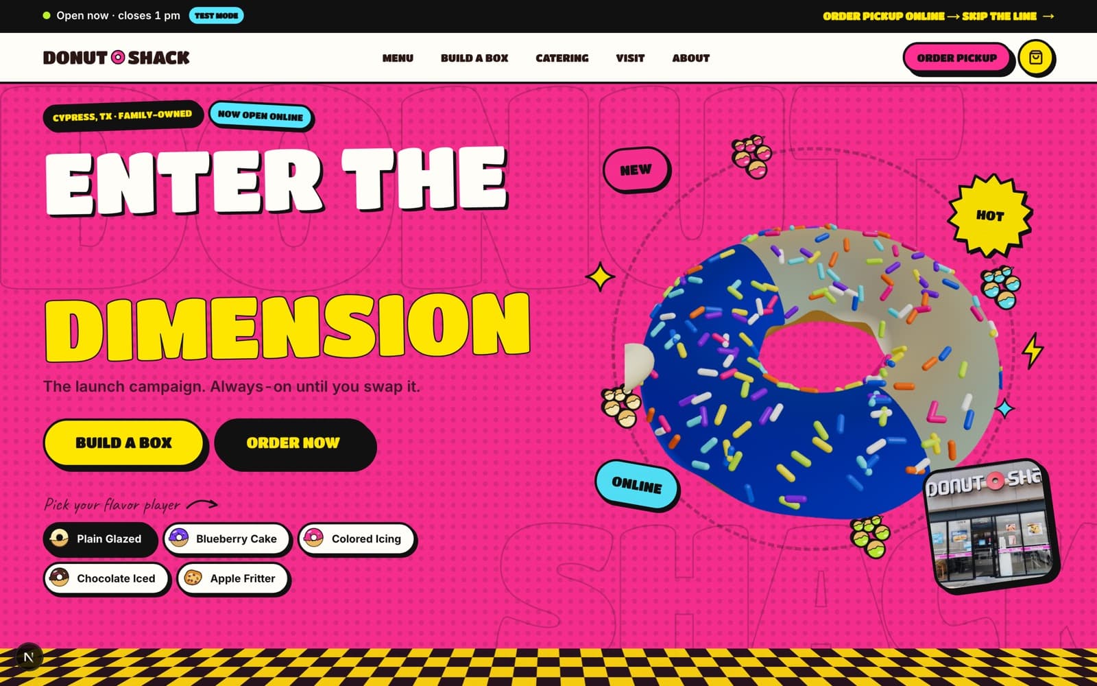
Donut Shack · Digital launch and ordering platform
From a Facebook page to a digital storefront the shop actually owns.
Zero to one: a vibrant, recognisable digital storefront paired with the operational tools needed to turn online interest into fulfilled local orders.
- Client
- Donut Shack
- Sector
- Local food · Ordering platform
- Where
- Cypress, Texas
- Engagement
- New website plus ordering and admin platform
- Year
- 2026
- Services
- Brand and illustration system · Storefront design and build · Menu and ordering experience · Pickup scheduling · Customer notifications · Owner admin and fulfilment · Inventory and availability management
- Built with
- Next.js · TypeScript · PostgreSQL / Prisma · GSAP · React Three Fiber · Transactional email and SMS · Web push
The gap
Donut Shack already exists in the lives of its customers. People in Cypress know it, drive to it, and post about it. The business is not the problem.
The problem is that every piece of its digital life is rented. Discovery, menu, pricing, availability and ordering all run through a channel the owners neither control nor own the data from.
This is a zero-to-one engagement, not a redesign. There is no bad old website to point at — there is an absence, and the absence is doing real damage every morning the case sells out before the people looking for it know it exists.
Before — a business renting its own front door
There is no previous website to critique. Donut Shack's entire online presence is a Facebook page: the menu, the hours, the photographs and the orders all live on a platform the owners do not control and cannot change.
What the absence costs, every morning
There is no bad old website to critique here, so these are not audit findings from captures. They are the consequences of having no owned digital presence at all — described from what the business runs on today.
01
No owned address
Nothing to link on a receipt, a van, a business card or a search result. Discovery depends entirely on one social platform's ranking decisions.
02
The menu is a photograph
Prices, availability and what is actually in the case today are communicated through posts. Nothing is searchable, and nothing can be corrected once it is shared.
03
Orders arrive as conversations
A message thread is not an order. Someone has to read it, interpret it, price it, and remember it during a 5am rush.
04
No way to say “sold out”
Daily limits, seasonal items and kolache availability change constantly, and there is no mechanism to reflect that before a customer drives over.
05
No record
No order history, no repeat-customer insight, no way to see what sells — because the data belongs to the platform.
The strategic idea
Build the storefront and the back office at the same time, because a pretty menu that nobody can fulfil is worse than no menu.
Two products, one build. The customer side has to be appetising, fast on a phone and honest about what is available today. The owner side has to work at 5am with flour on your hands, on the phone in your apron pocket.
Availability is the hinge between them. If the admin can mark a kolache sold out and the storefront reflects it immediately, the whole system earns trust. If it cannot, customers learn to distrust the site and go back to messaging the Facebook page.
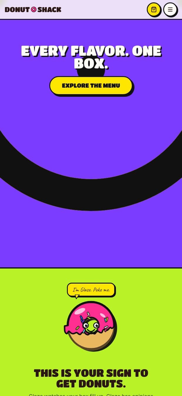
The brand can be loud. This is a donut shop, and the darker, restrained register that suits a beach house or a fight gym would be exactly wrong here. Warm product colour, packaging-like graphics, and micro-motion that feels like a shop rather than a SaaS dashboard.
Nothing here is claimed as launched. Every capability below exists in a development environment, seeded with draft content, with notifications captured to an outbox rather than delivered.
In development — a storefront and the system behind it
A bright, mobile-first storefront that looks like the shop, an ordering flow built around how people actually buy donuts, and an admin the owners can run from a phone behind the counter.
There is no previous website, so there is nothing to slide between. Everything shown from here is a development capture.
The storefront
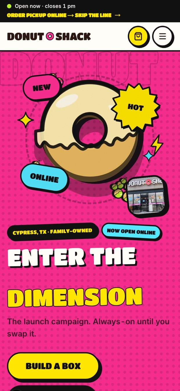
Bright, tactile and unmistakably local. The homepage says what the shop is, where it is, when it opens, and what is in the case — in that order, because that is the order people ask.
In development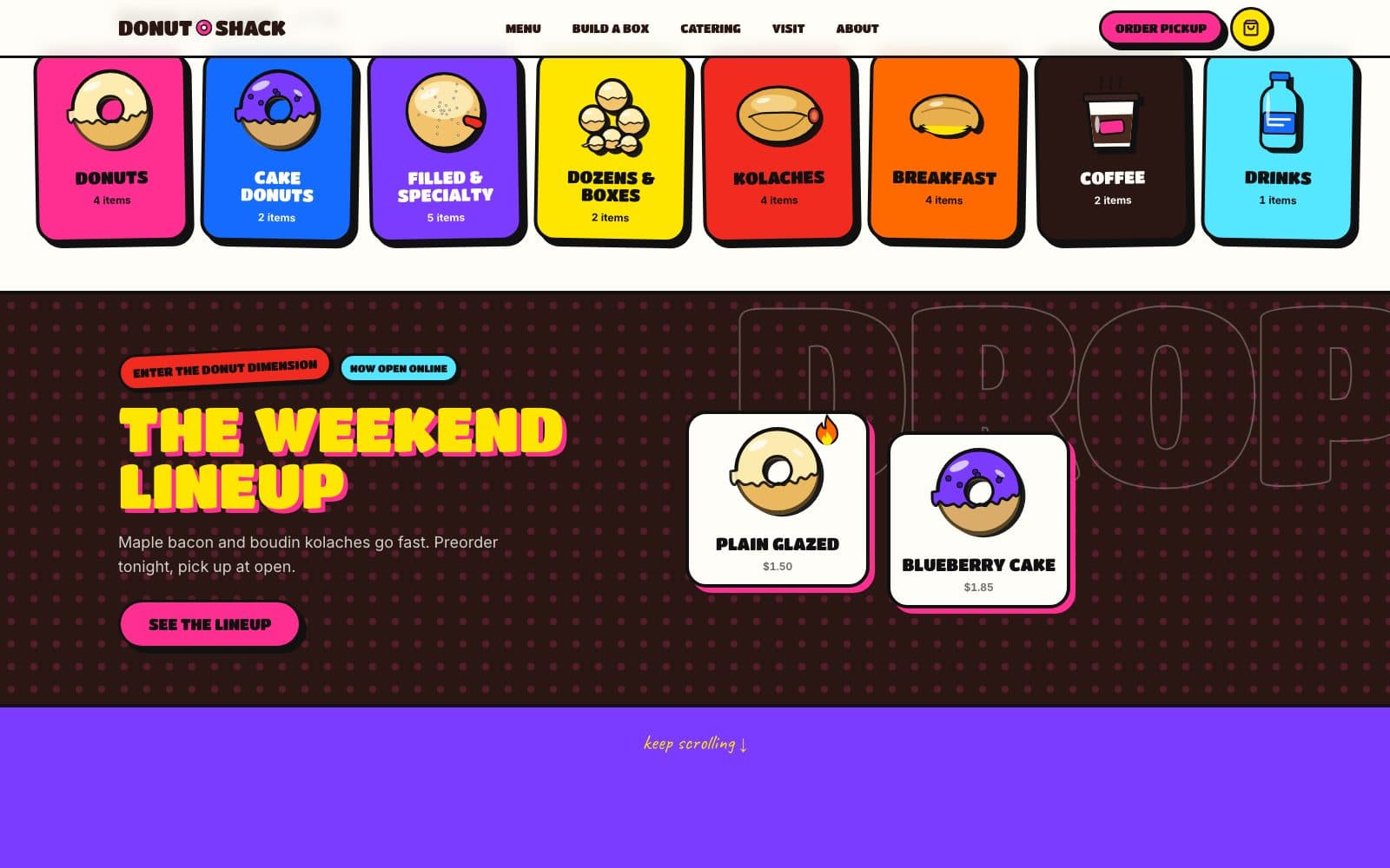 In development
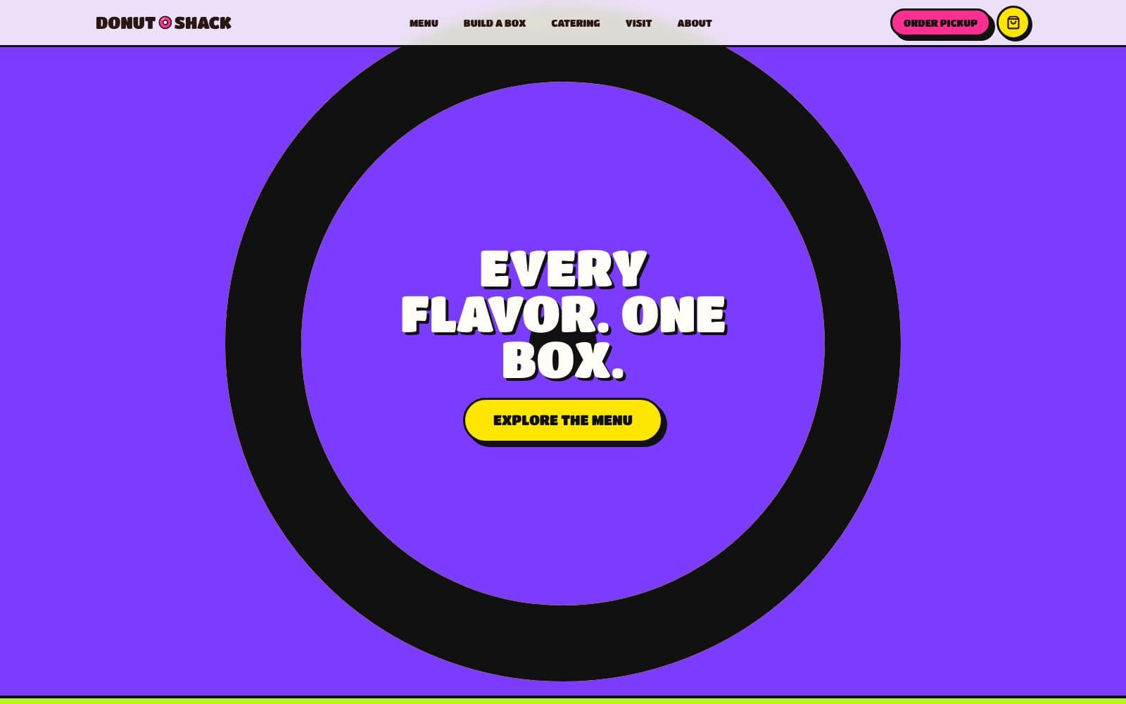 In development
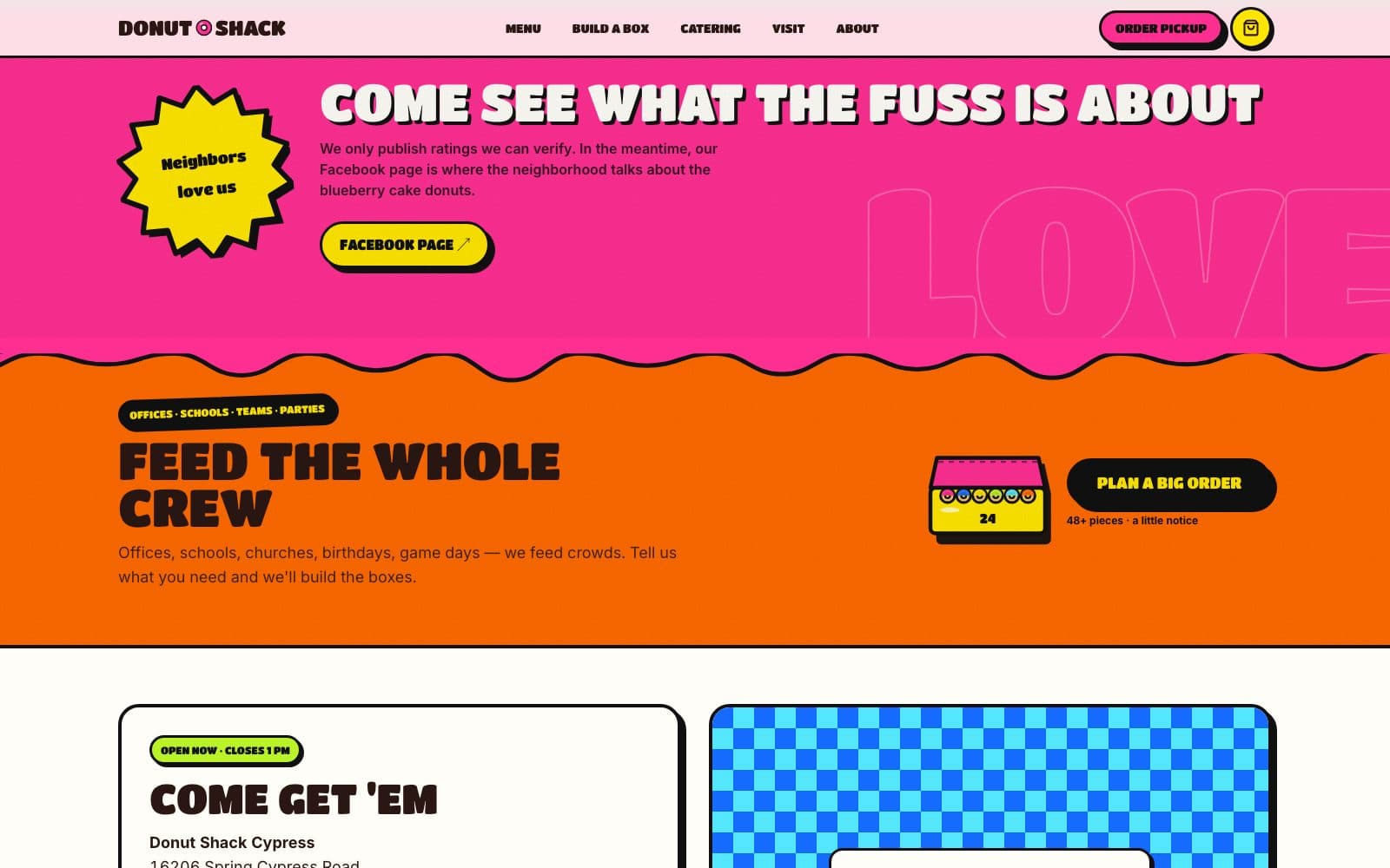 In development
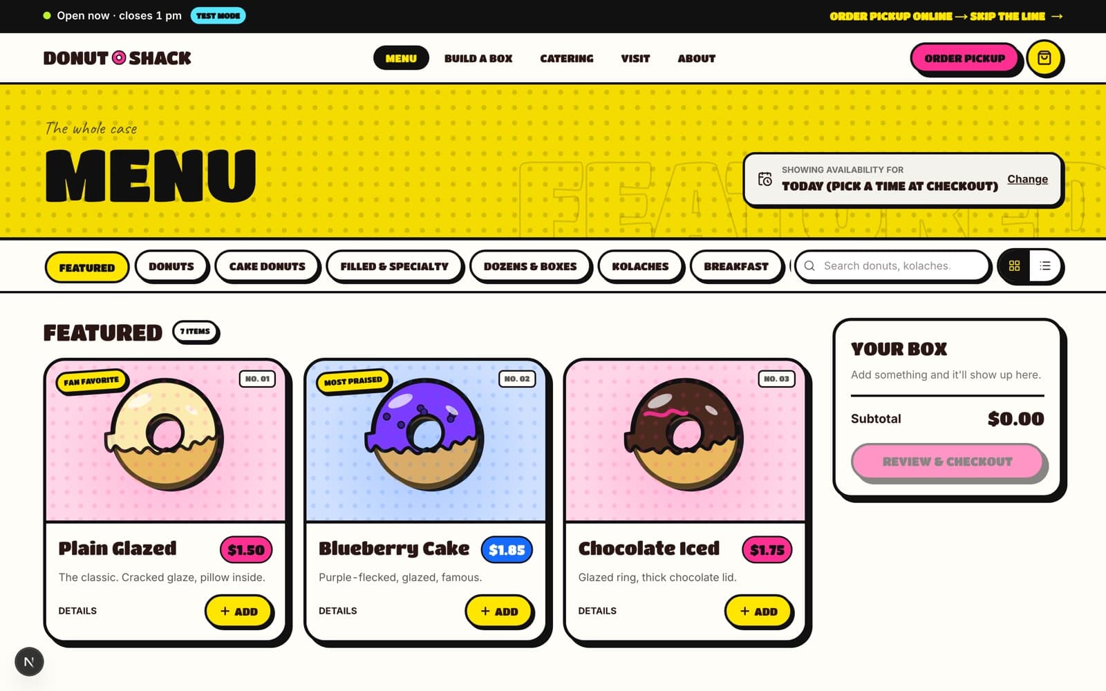
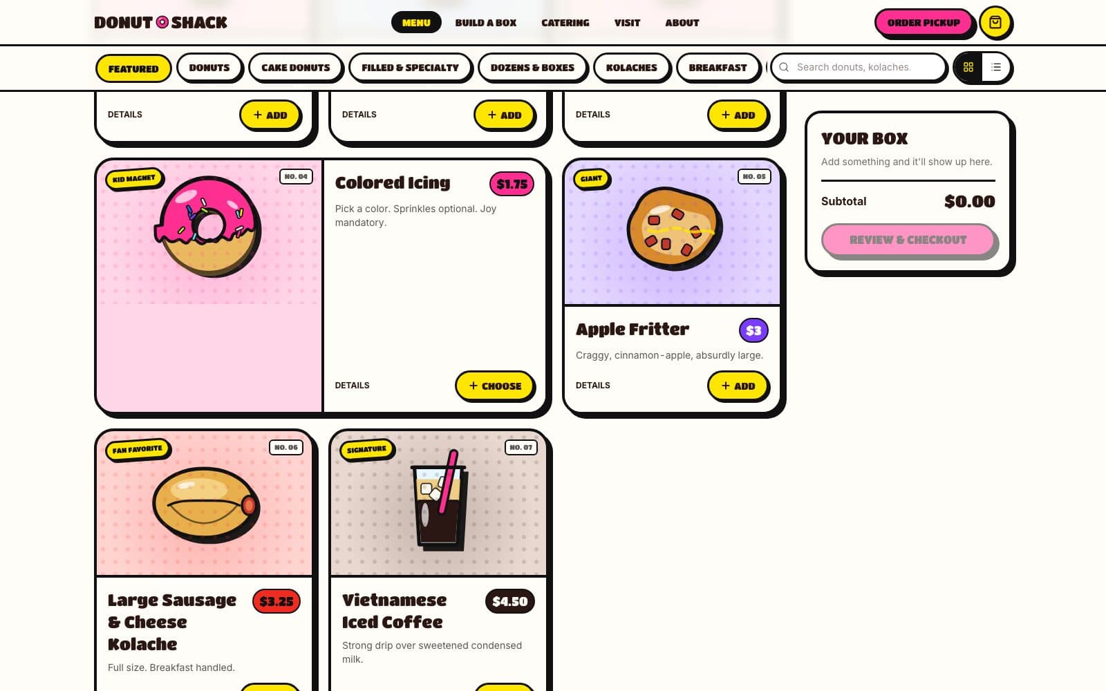
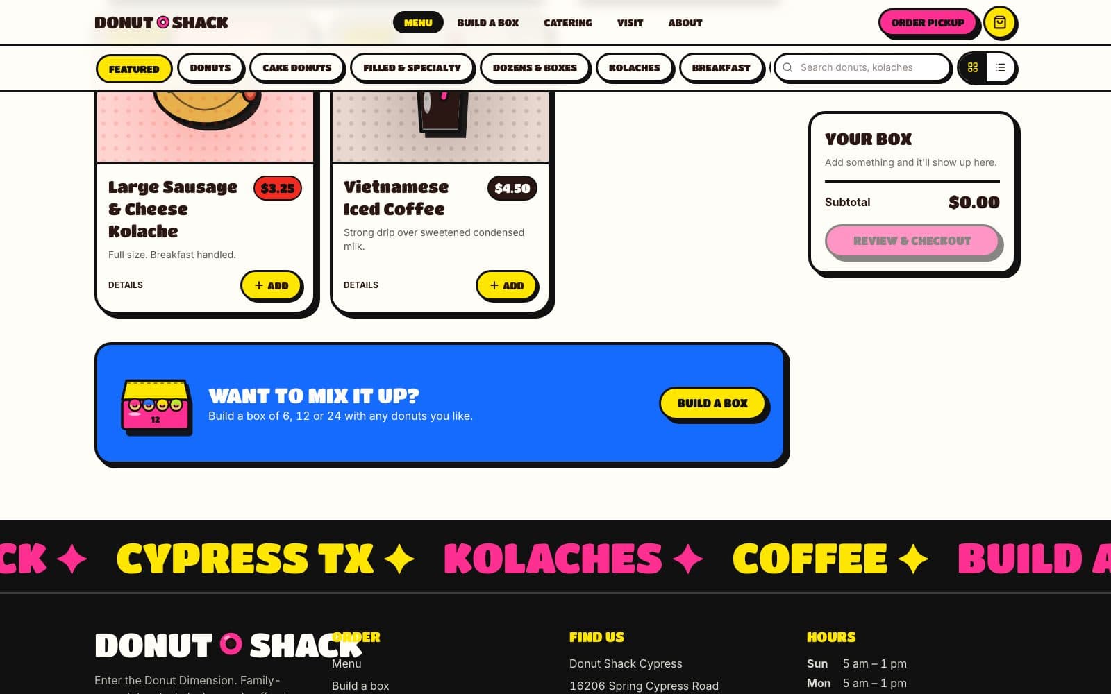
A menu that knows what is left
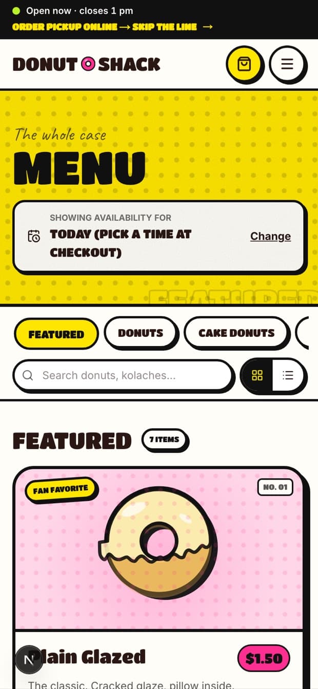
Every item carries its real price, its allergens, and whether it is available right now. Categories reflect how the shop actually sells: donuts, kolaches, boxes, catering.
Sold out is a first-class state, not an apology posted three hours late.
 In development
 In development
 In development
 In development
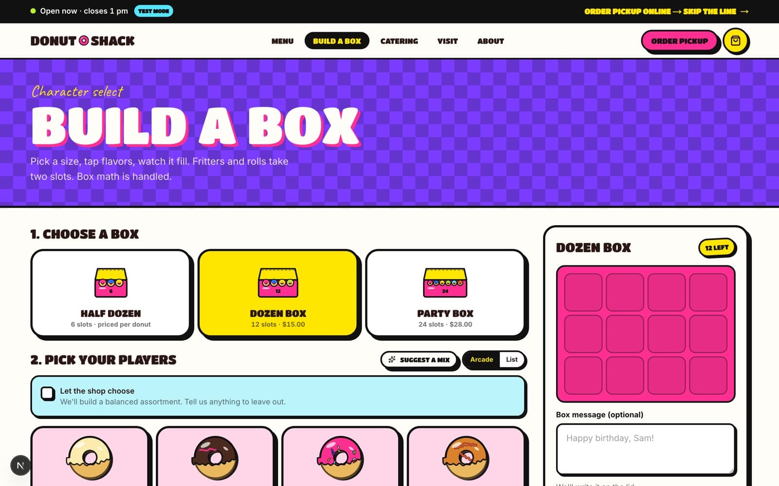
Ordering, and knowing it worked
Pickup scheduling respects the shop's real capacity: opening hours, daily limits, and how many boxes one person can genuinely assemble in a fifteen-minute window.
After an order, the customer chooses how they want to hear about it — email or SMS — and gets confirmation and status. In development these messages are rendered and captured to an outbox rather than delivered; nothing on this page claims a message has been sent to anyone.
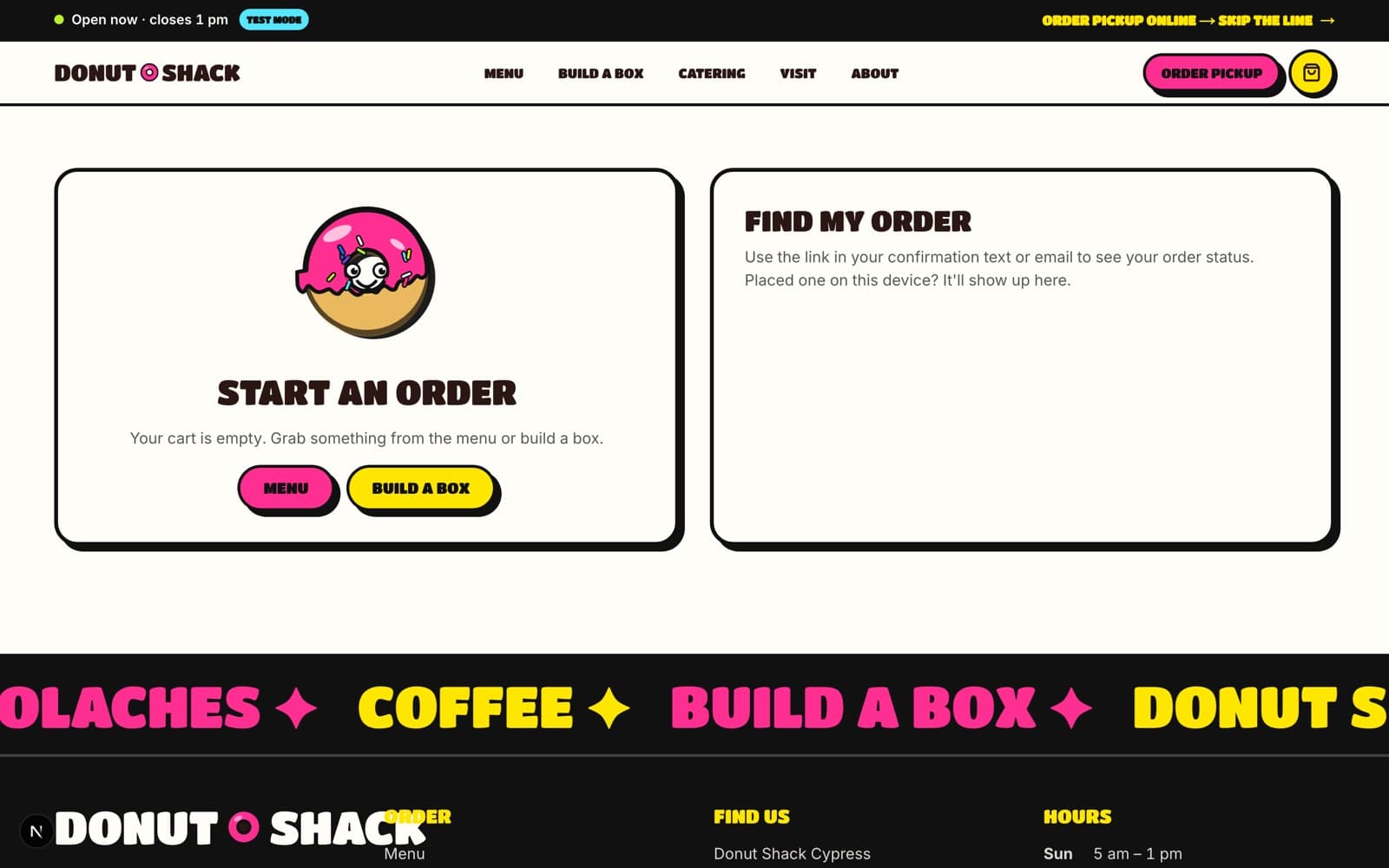 In development
The half nobody sees
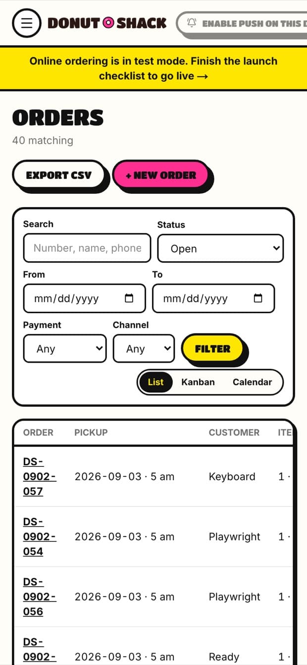
This is the part that decides whether the project works. An order queue the owner can clear from a phone. Product and price management without calling us. Inventory and daily limits. Message history. Reporting on what actually sells.
A beautiful storefront on top of a manual process is just a prettier way to lose orders.
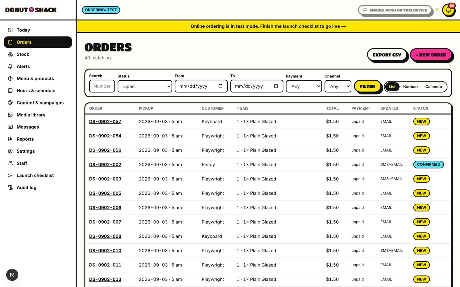 In development
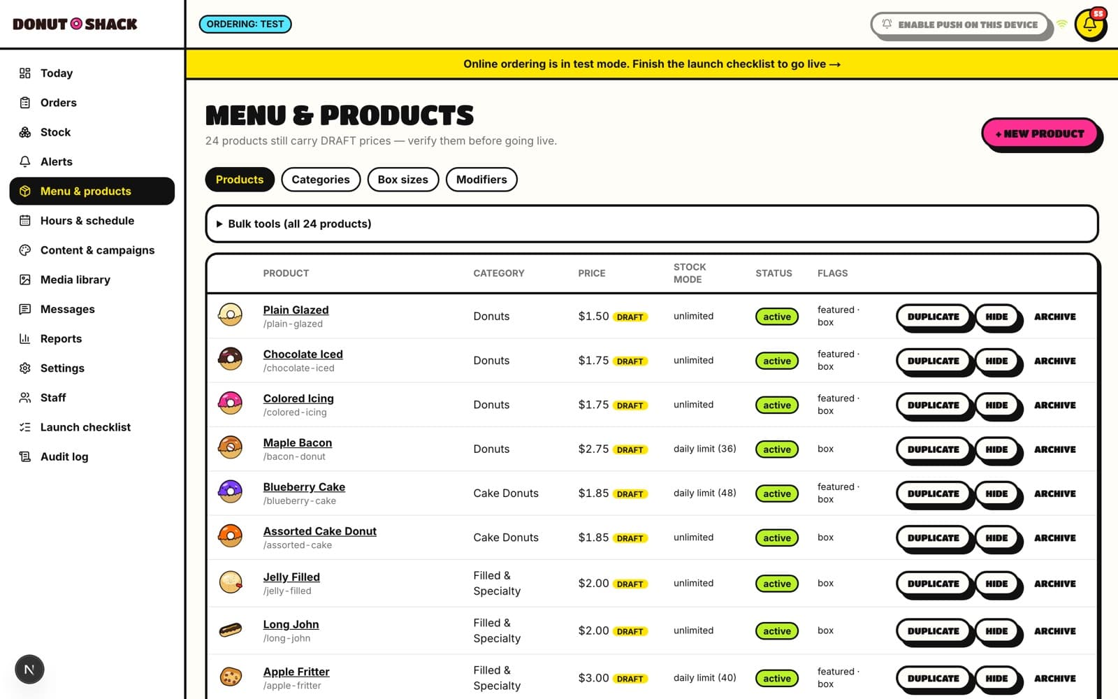 In development
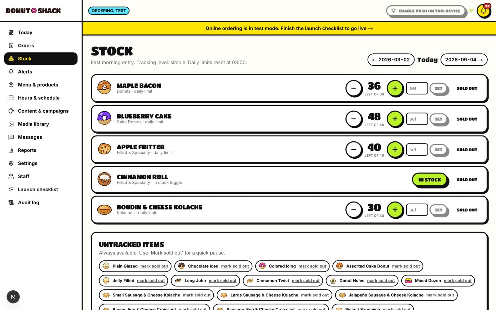 In development
Built for the phone in the parking lot
Almost every order will start on a phone, often while someone is already driving toward the shop. The mobile storefront is the primary composition, not the fallback.
 In development
 In development
 In development
 In development
Intended outcomes — not results
What this is designed to change
Nothing here is live. There are no customers, no orders and no results. These are the outcomes the platform is being built to produce, and they will stay written this way until the shop is trading on it.
- Give Donut Shack an address it owns, that it can put on a sign, a receipt and a search result.
- Let a customer see the real menu, the real prices, and what is genuinely available today.
- Turn a message thread into a scheduled, priced, confirmed pickup order.
- Give the owners a fulfilment queue and content controls they can run from a phone.
- Keep the order history, so the business can finally see what it sells.
Donut Shack is proof that a website is sometimes the smaller half of the job. The shop needs a storefront people want to look at — and a system that can take the order once they do.
Still open
- Owner photography. The only image confirmed so far is the shop's public profile picture; the rest must come from the owners' own files rather than scraped from Facebook.
- Final menu, pricing and daily limits confirmed by the owners.
- Live payment provider decision, launch date and domain.
Is your site doing the same thing to you?
Donut Shack is mid-rebuild. If you recognise the problem, that is where yours would start too.
Start a transformation