
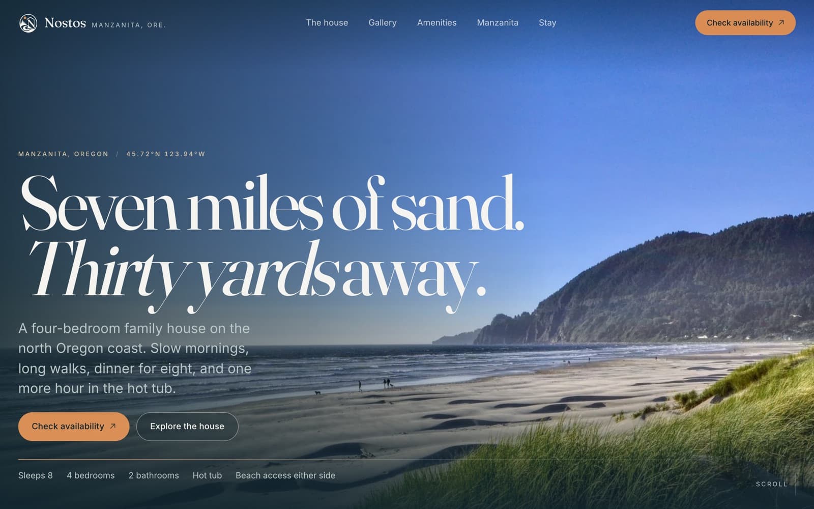
Nostos Beach House · Hospitality transformation
From a guest manual to a beach house worth booking.
Practical information became a site that sells the stay: a fuller story of the house for people still choosing, clearer paths to booking, and a reorganized guest guide for the stay itself.
- Client
- Nostos Beach House
- Sector
- Hospitality · Vacation rental
- Where
- Manzanita, Oregon
- Engagement
- Redesign and rebuild
- Year
- 2026
- Services
- Experience audit · Brand and art direction · Editorial photography direction · Responsive front-end build · Content architecture · Booking pathways · Technical SEO and redirects
- Built with
- Next.js · TypeScript · Custom motion system · Image pipeline · 301 URL migration
The problem
Nostos is a four-bedroom family house on the north Oregon coast, thirty yards from seven miles of open beach. Guests who have stayed there describe slow mornings and long walks. None of that reached anyone who hadn't already booked.
The audit turned up something the brief hadn't expected. The old nostosbeachhouse.com wasn't an outdated marketing site at all. It was a ten-page private guest guide: check-in, house policies, how-to guides, beach access, hot tub, emergency numbers, tsunami evacuation, check-out. Useful, written with real care, and invisible to anyone still deciding whether to stay.
So this wasn't really a redesign. Half of what the business needed was missing: everything between “someone hears about this house” and “someone books it” had never been built.
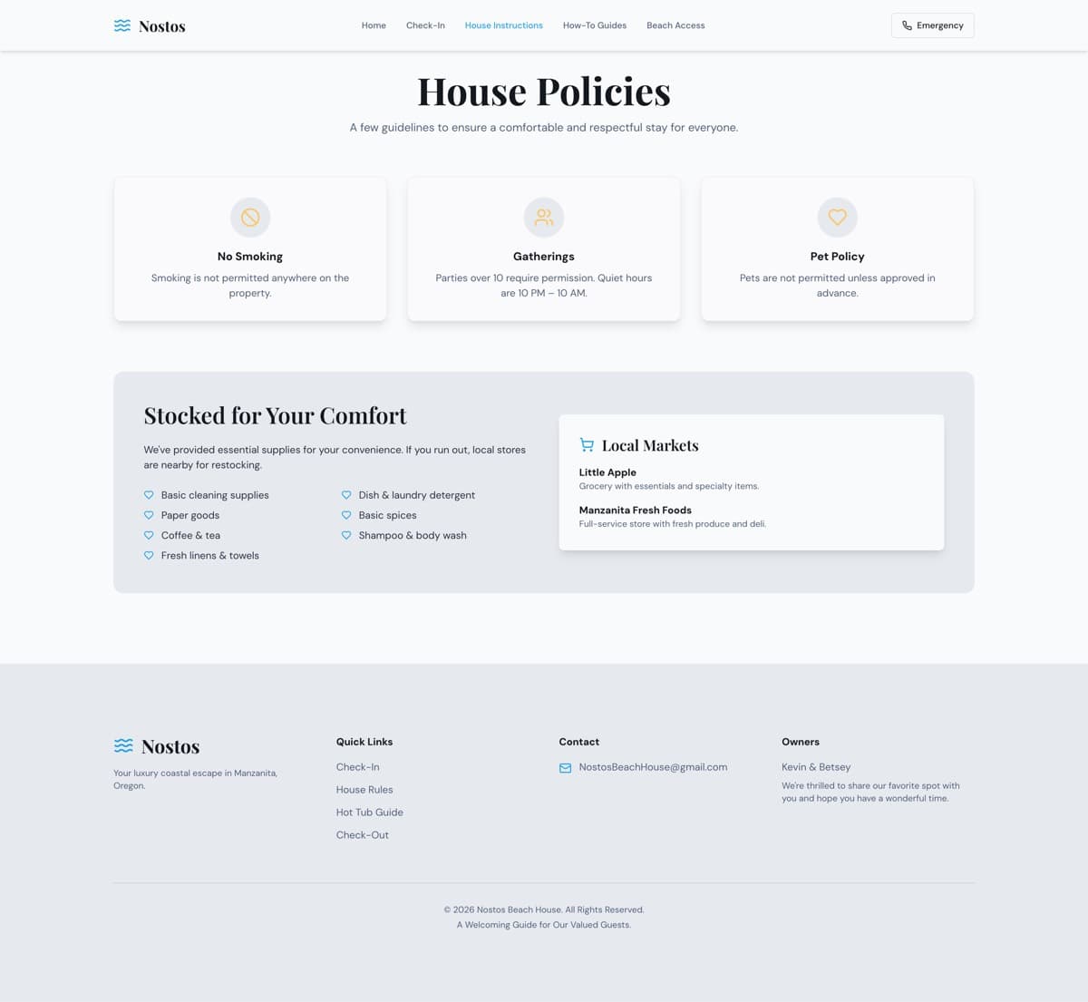
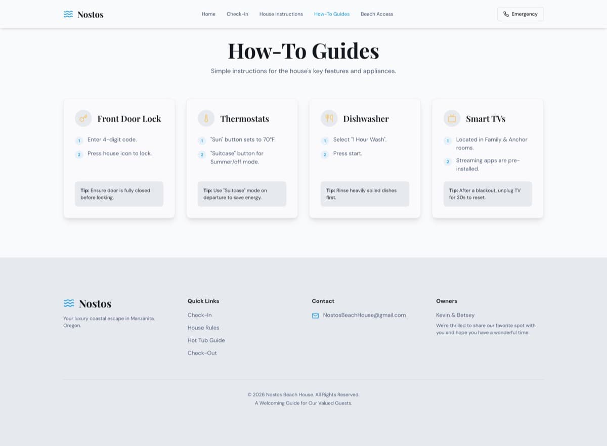
Before: a guest guide doing a website's job
Clean and functional, but built for people who had already booked. Few photos, the same pale cards over and over, no way to book, and reveal effects that could leave whole sections nearly invisible.
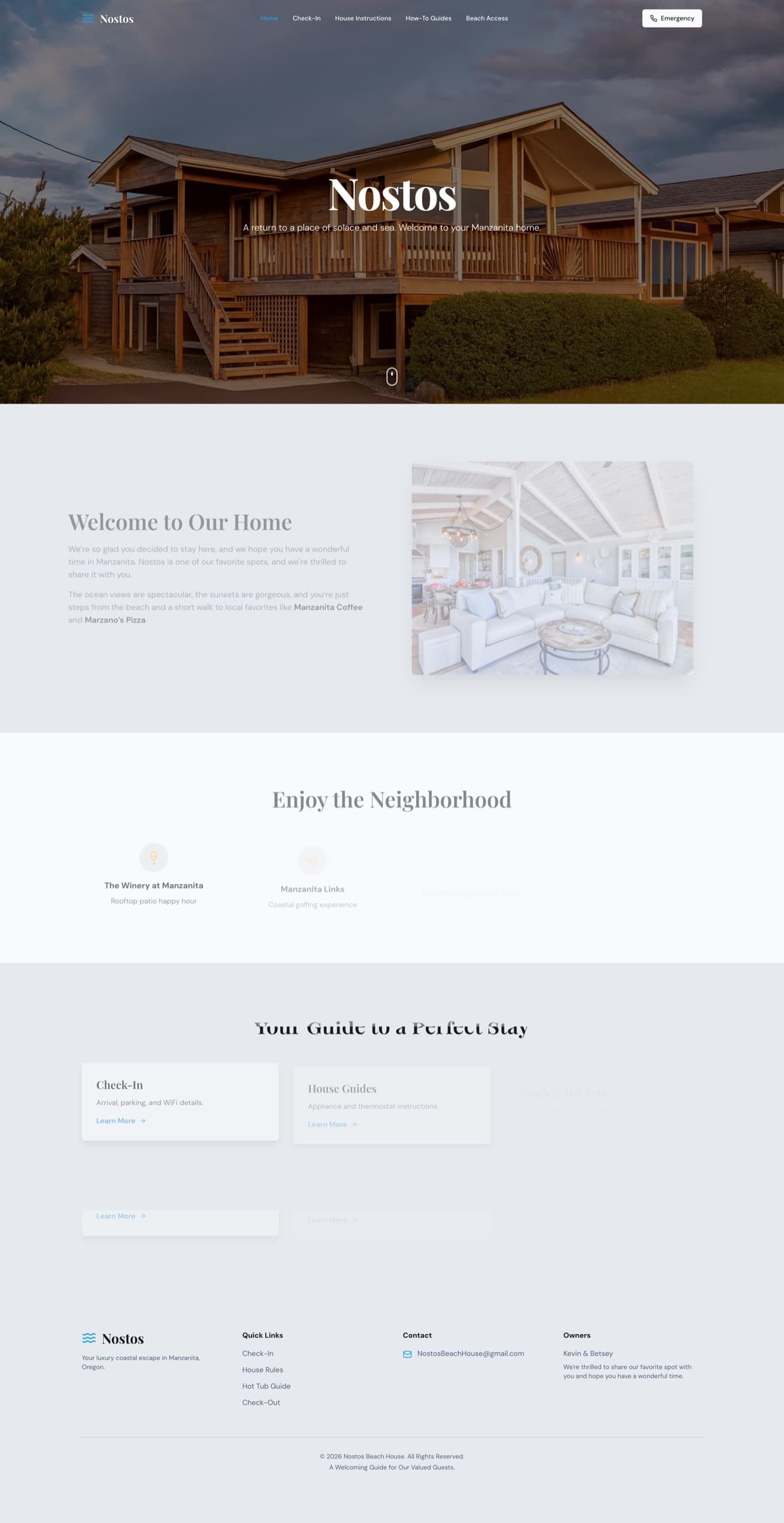
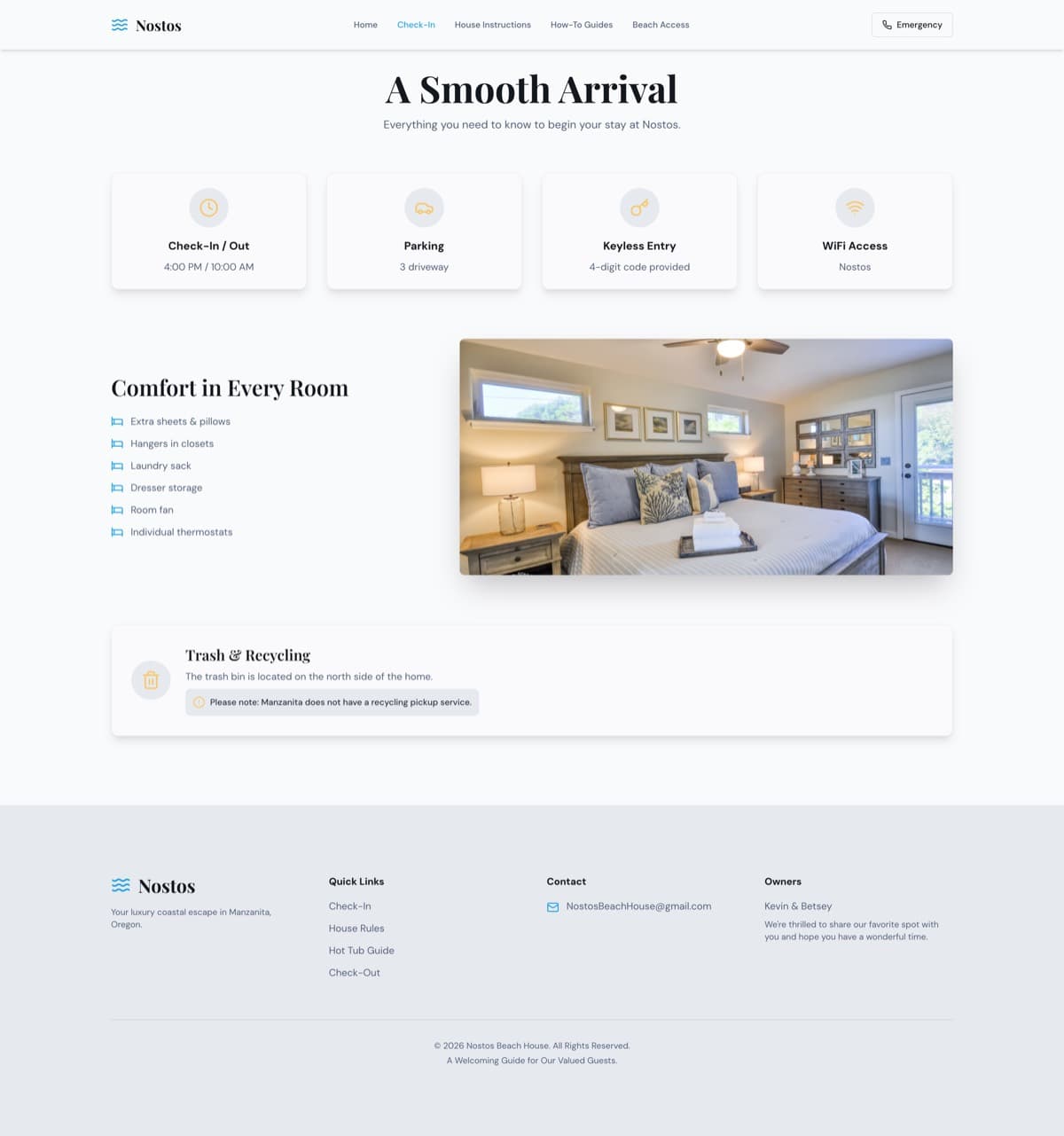
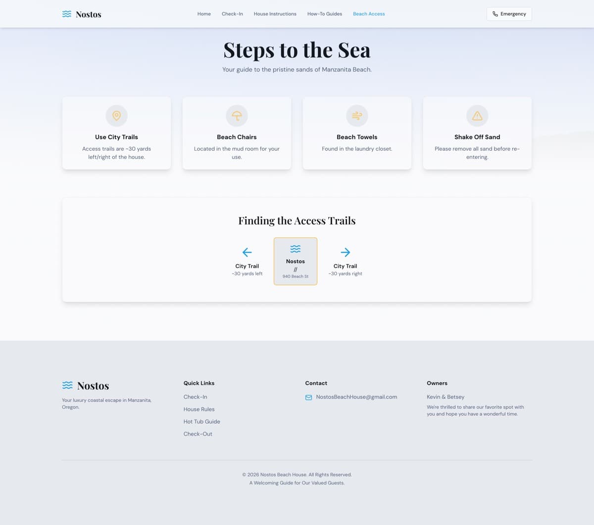
Five desktop captures of the previous site, taken 2 September 2026. They're shown at full page height because the length is part of the finding: big stretches of empty space, oversized footers, and card after card of information that all looks the same.
This isn't a bad website. It's a good guest guide that was being asked to do a job it was never built for.
 Before
 Before
 Before
 Before
 Before
What the captures substantiate
Six findings, each one visible in the captures, not guessed at. We didn't test mobile behavior, performance, accessibility code or the booking system, and we make no claims about them here.
01
No path to booking
The menu led with Check-In, House Instructions, How-To Guides and Beach Access. Someone still choosing where to stay found no rates, no availability, no room details, and no reason to pick this house.
02
Too few photos
One outside photo and one inside shot had to carry the whole property. The beach, the living spaces, the bedrooms and the hot tub were described in words instead of shown.
03
Everything looked equally important
Policies, directions, amenities and appliance instructions all sat in nearly identical floating cards. Arrival details looked exactly as important as how to work the fireplace.
04
Content that could disappear
In the captures, some homepage sections, including the neighborhood content and guide cards, were almost see-through. When a reveal effect doesn't finish, the content just isn't there.
05
Hard to find your way
House Instructions, House Policies and House Rules covered overlapping ground, and several pages could only be reached from the footer.
06
A brand with no world around it
The wave logo was a good start, but nothing on the site built on the meaning of nostos: the return home.
The big idea
Build the part that helps people find and choose the house, and keep the guide the owners wrote.
Two jobs, one site. The marketing and booking side is new: the story of the house, the photography the coastline deserves, room and amenity details, verified walk and drive times, and direct links to the Vrbo and Airbnb listings. The guest guide is kept, not replaced. Every old web address permanently redirects (a 301) to its new home under /guide, so nothing a past guest bookmarked breaks.
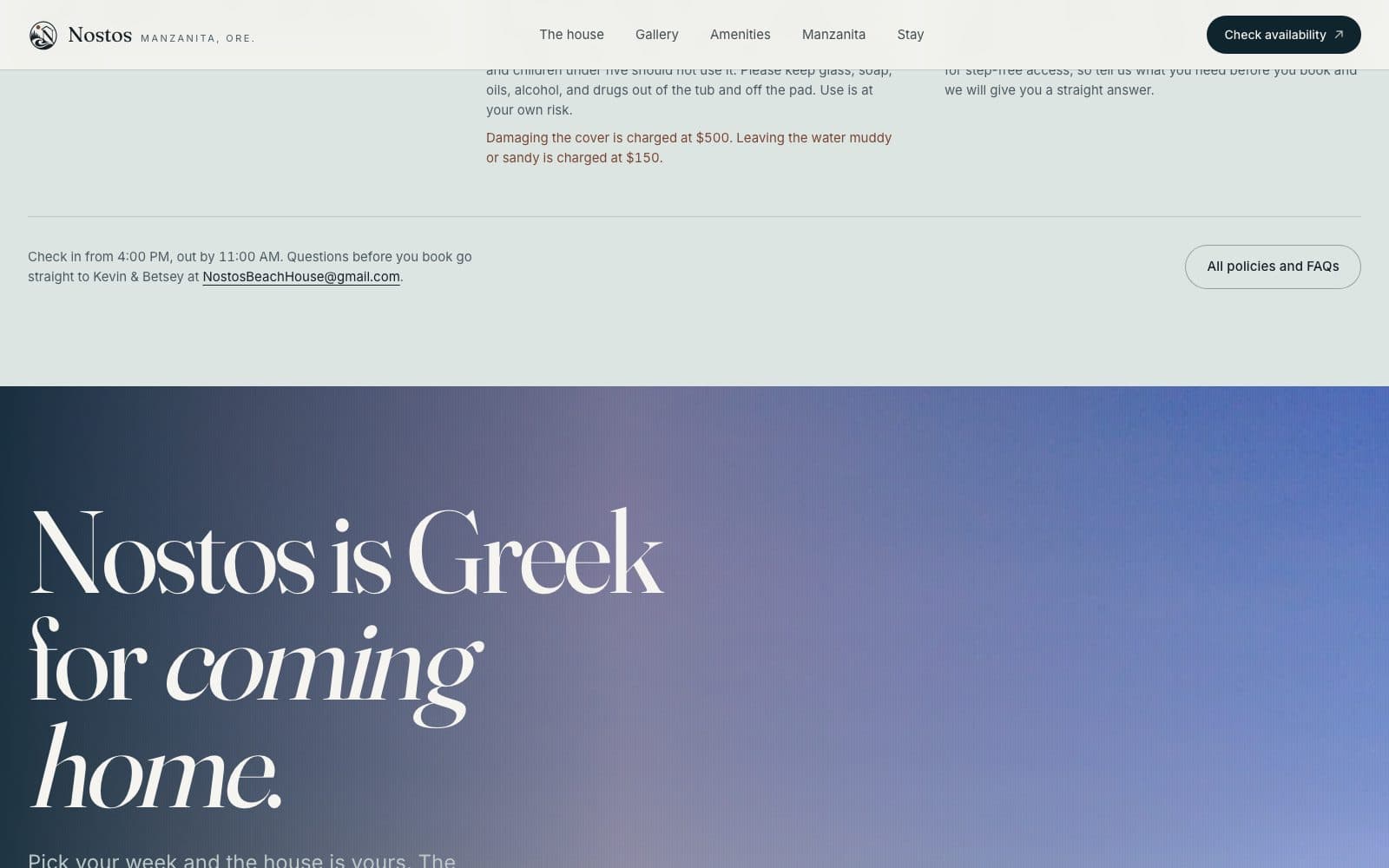
The design idea came from the word itself. Nostos is Greek for the homecoming, the return. The site is paced like an arrival: the horizon first, then the house, then the room you'll actually sleep in, then the town, then the practical details you need once you're standing in the kitchen.
Every fact on the finished site has a source. Where the old guide and the live listing disagreed (check-out time, hot-tub damage fee), the listing wins, and the conflict is written down rather than quietly smoothed over.
Before and after
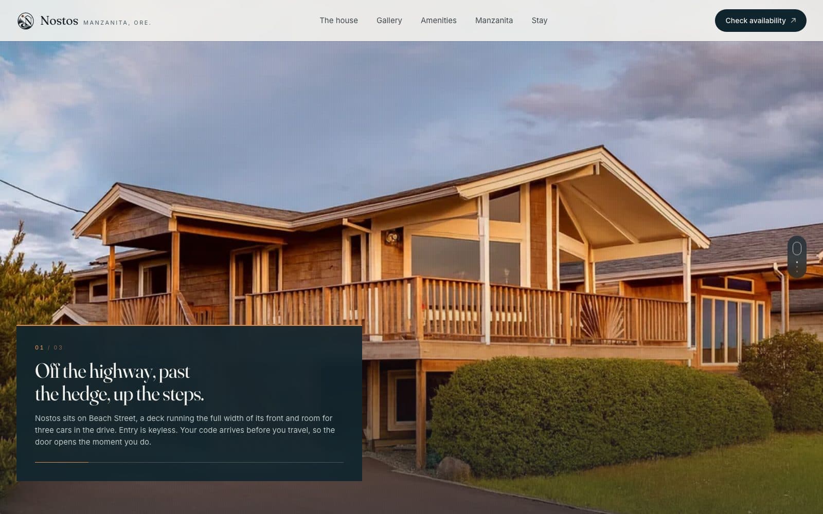
The same page, before and after. Drag the slider, or select it and use the arrow keys.
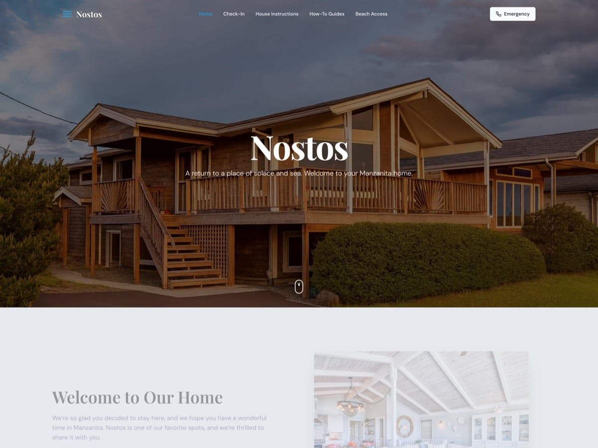
Arrival
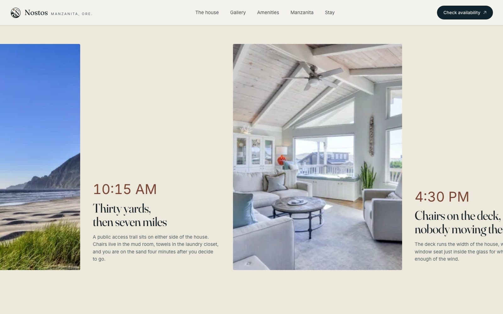
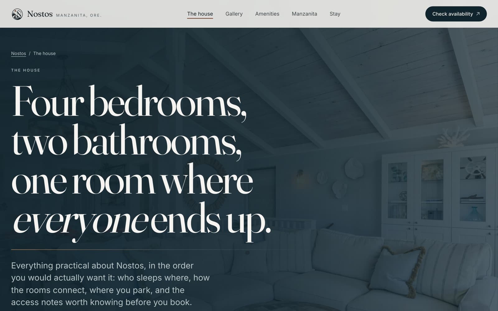
The homepage opens on what people actually come for: seven miles of sand, thirty yards from the door. The headline states the property's strongest selling point and gets out of the way.
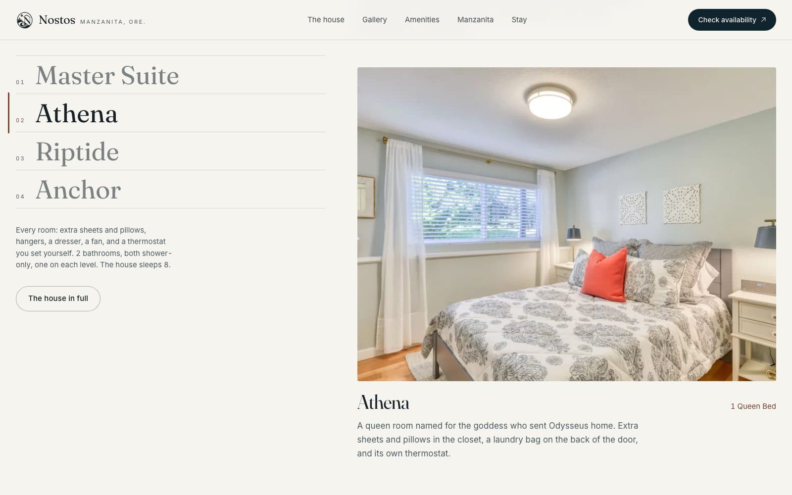
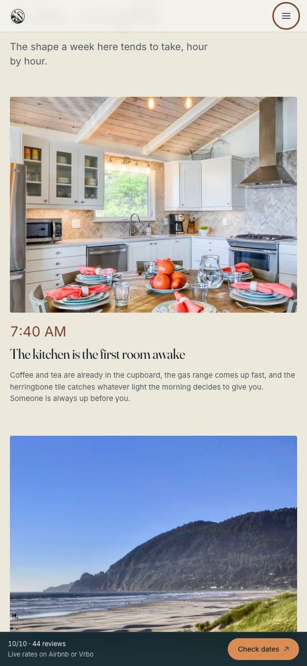
Further down, the house comes into view in order: the rooms, the light, the hot tub, the walk to the water. The numbers a guest checks before booking sit in one quiet line: sleeps 8, four bedrooms, two bathrooms, beach access either side.
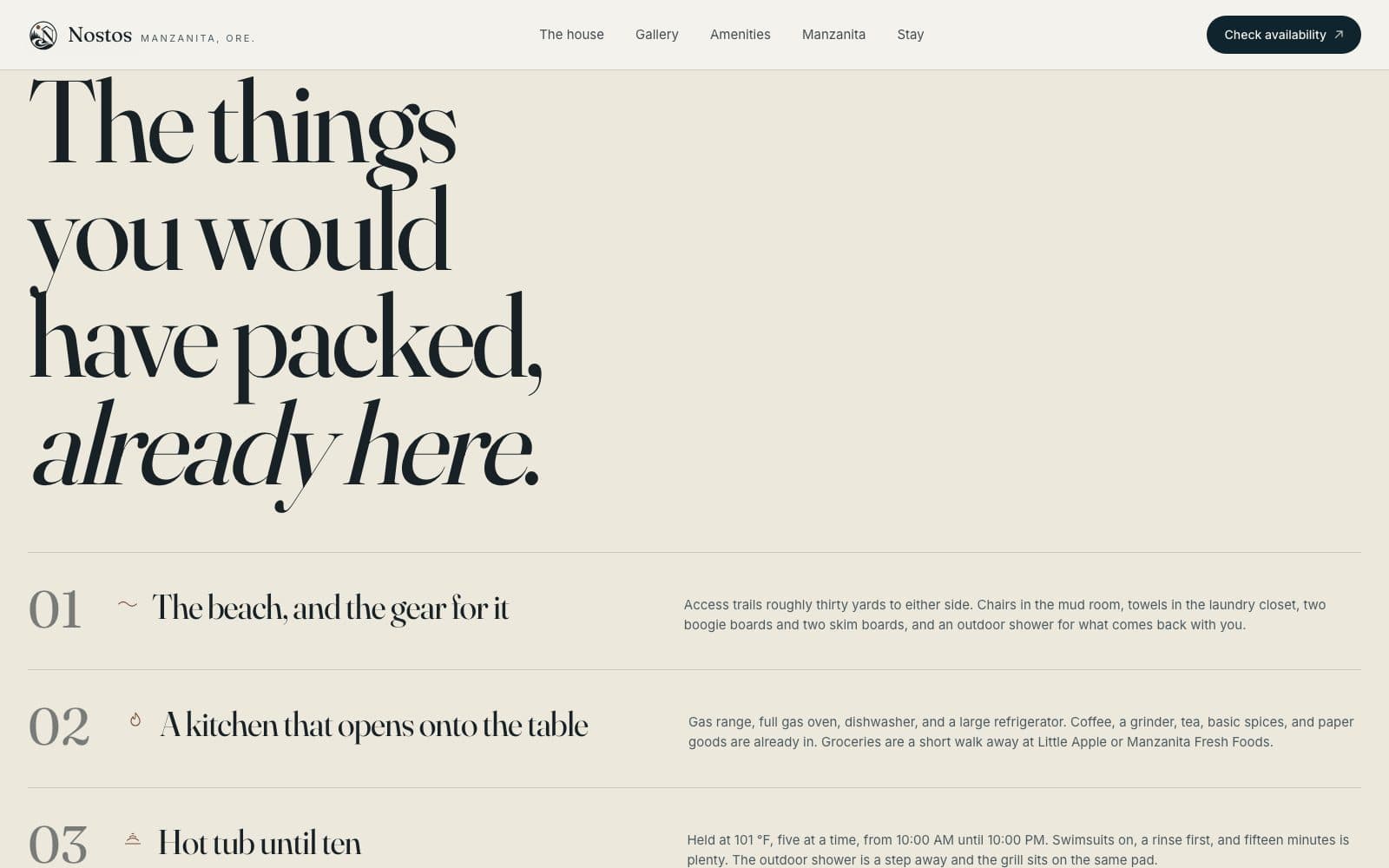
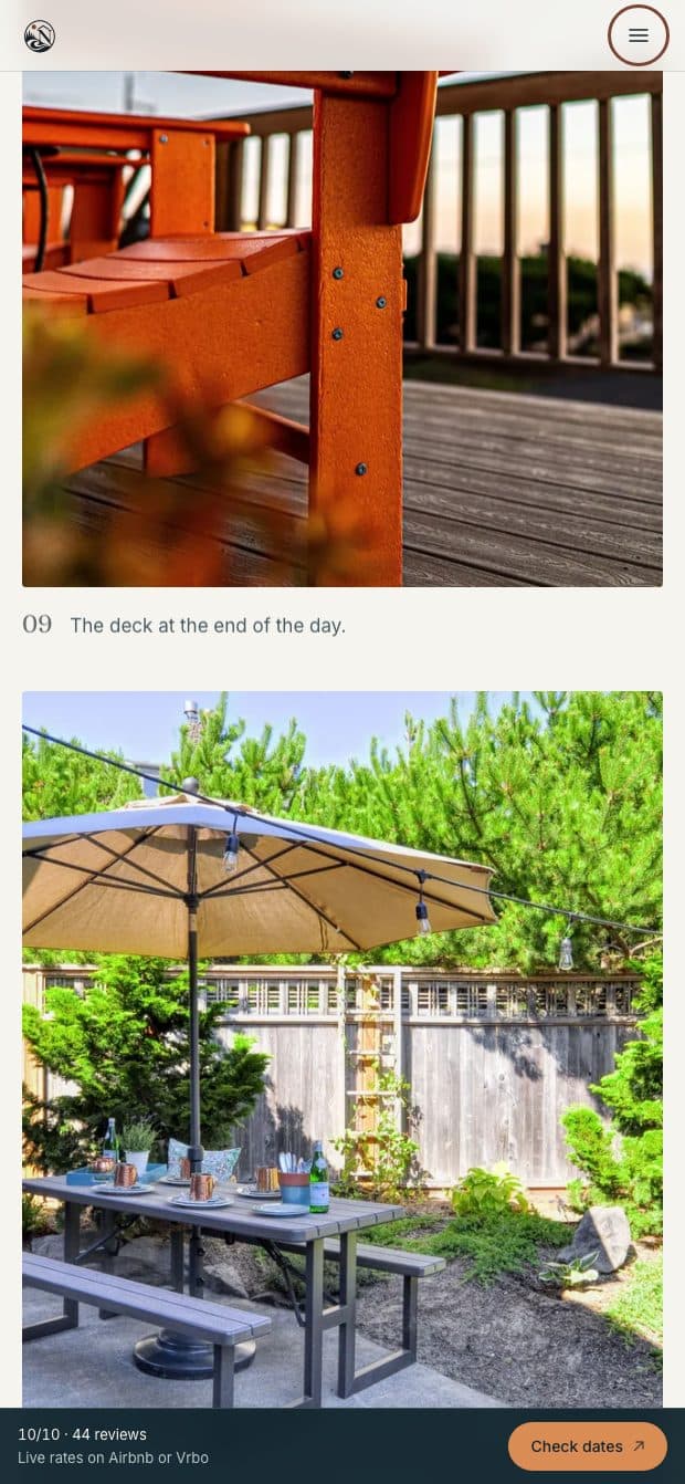
The images below run down the homepage in the order a visitor sees them, because the opening photo is the least of it.
The house, shown honestly
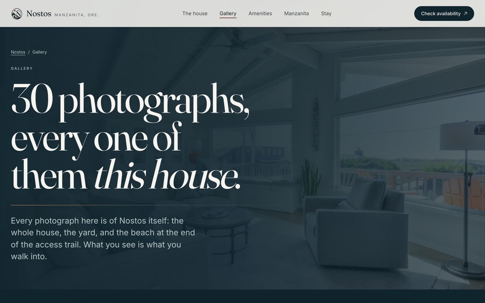
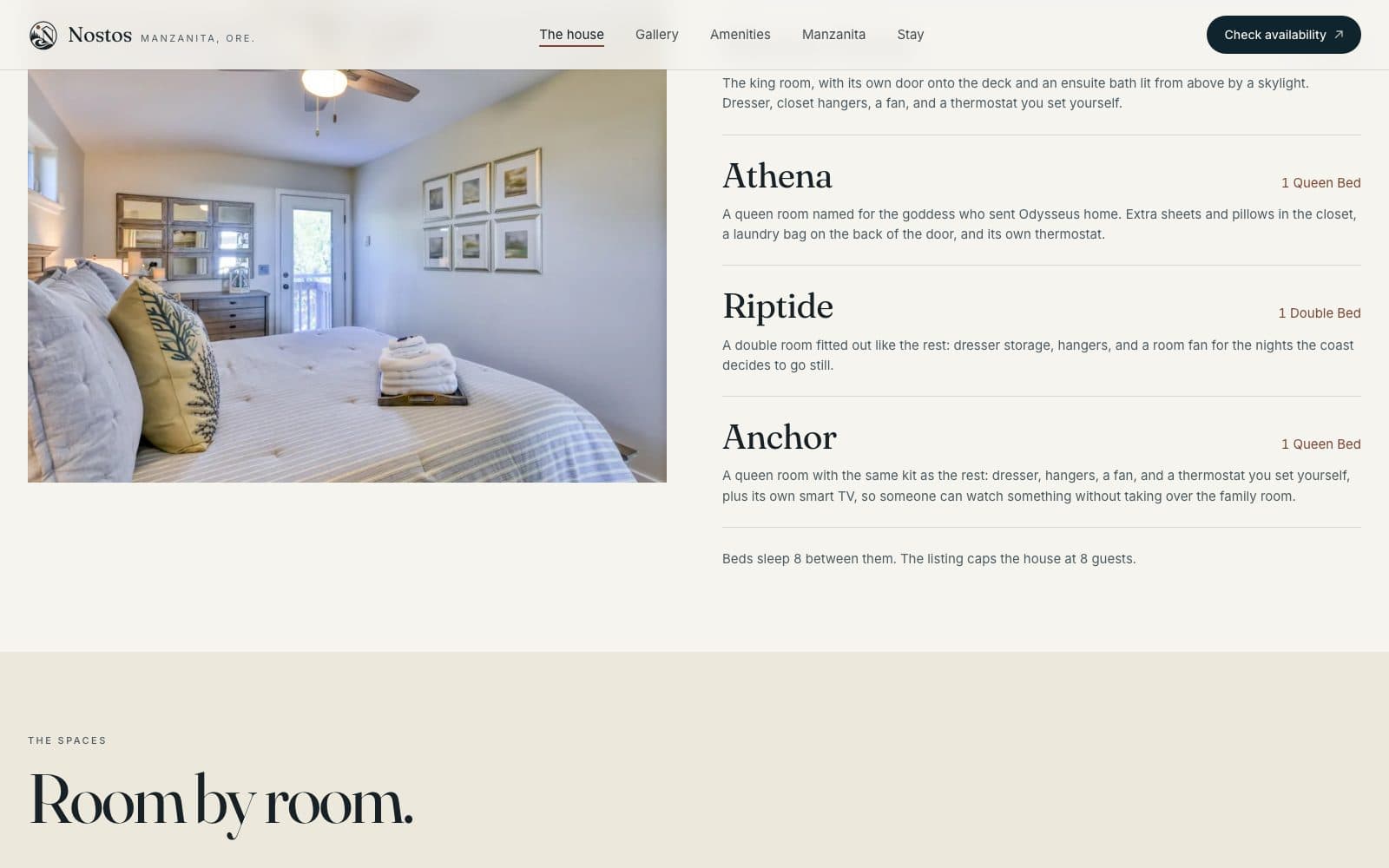
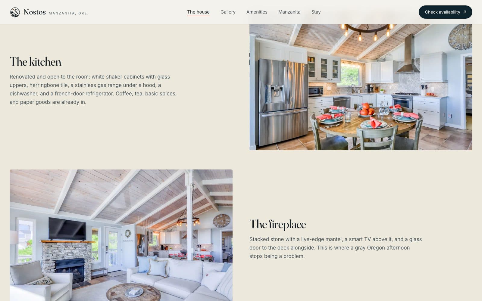
The owners take their own photos of the house, and they're good. The redesign gives them room: full-width images of the coastline, photos paired up for the interiors, and a gallery that shows forty-odd photos in sequence instead of dumping them in a grid.
Nothing is styled beyond what the house is. It's a family beach house, and the look says so.
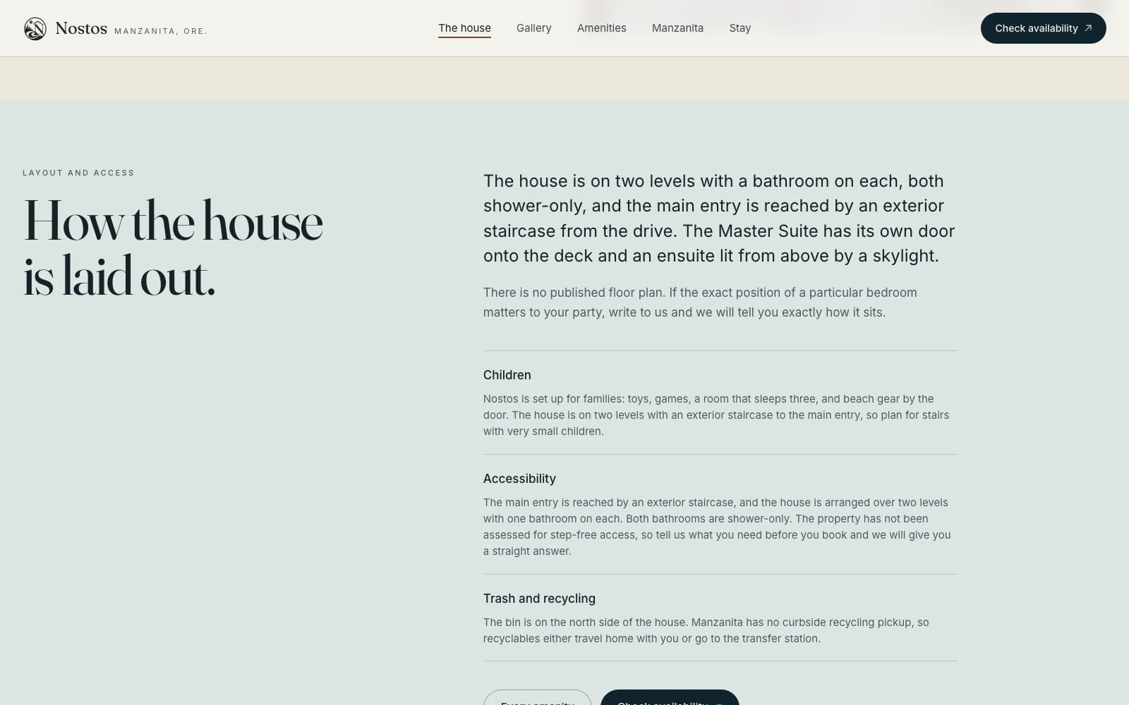
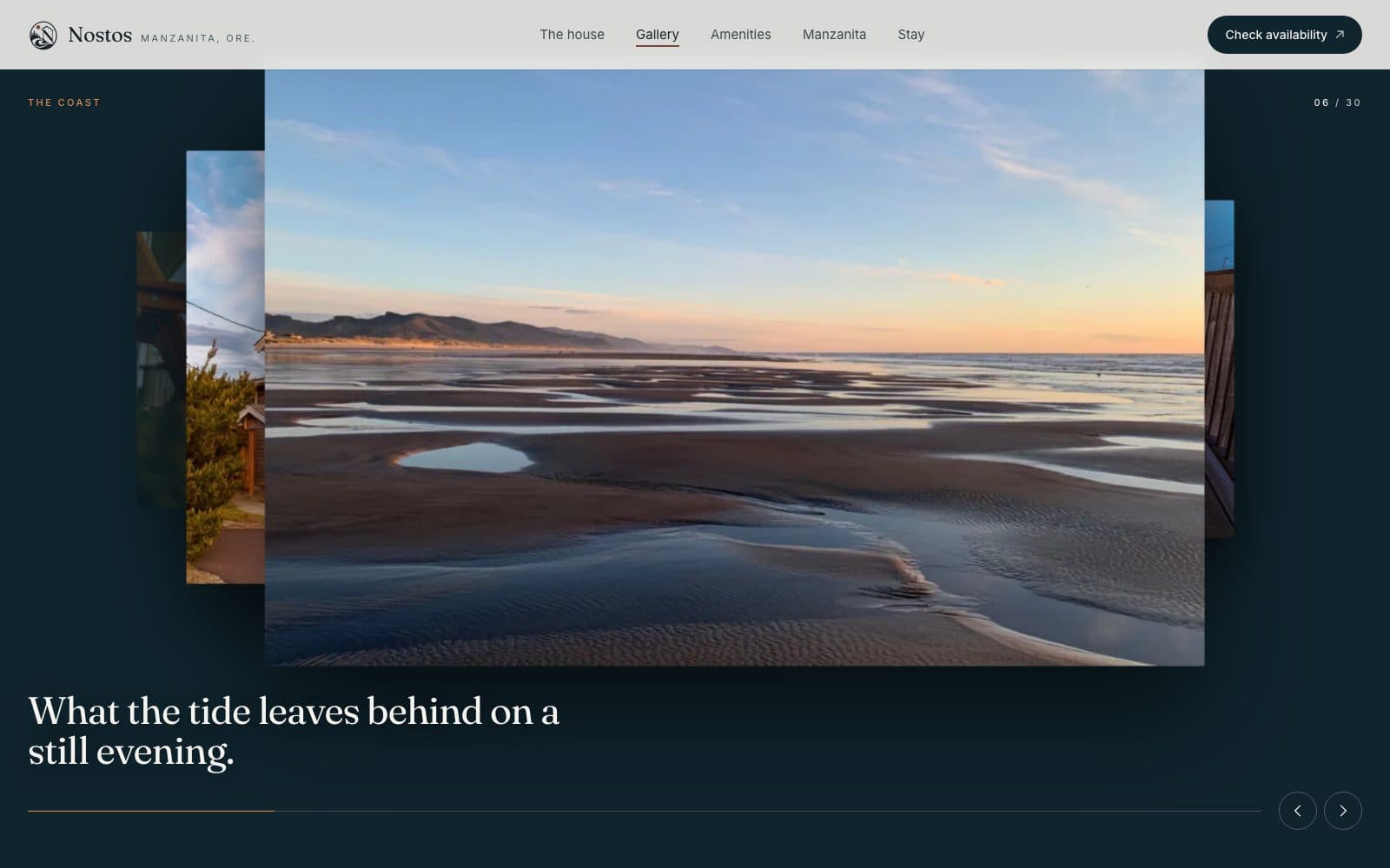
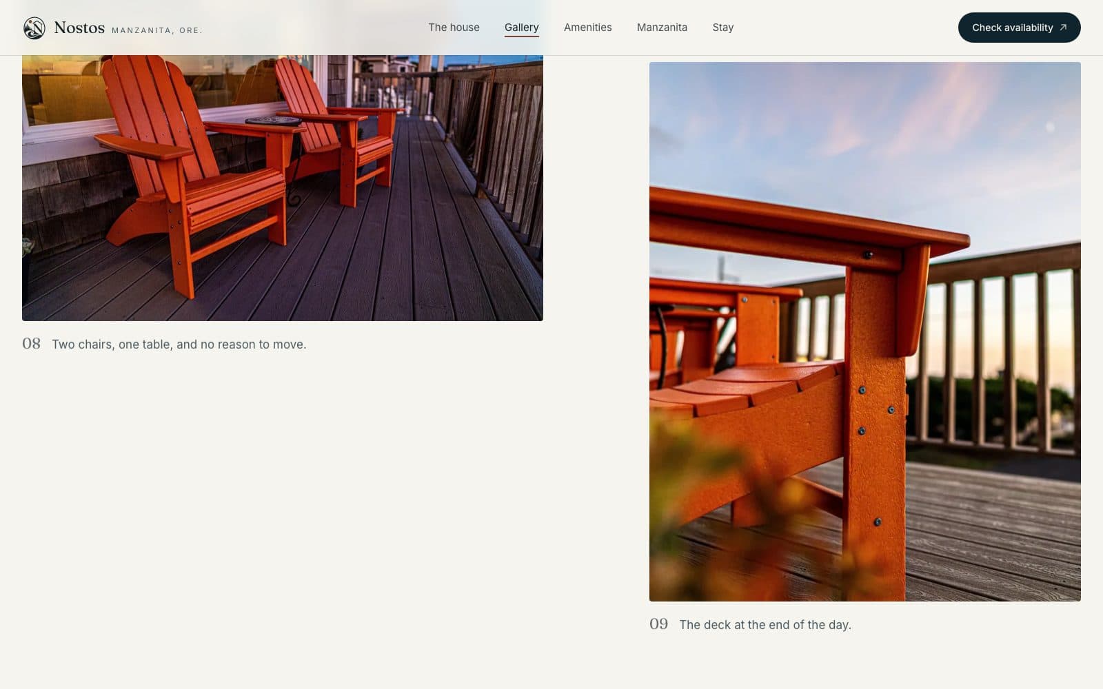
The details people book on
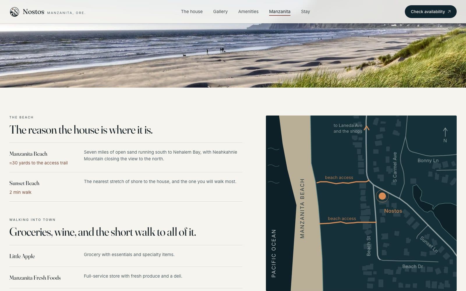
Two pages the previous site had no room for. Amenities lists all seventy-odd of them, grouped the way people actually look for them. Every entry is either published by the owners or listed on the Vrbo page. Nothing is listed that isn't really there.
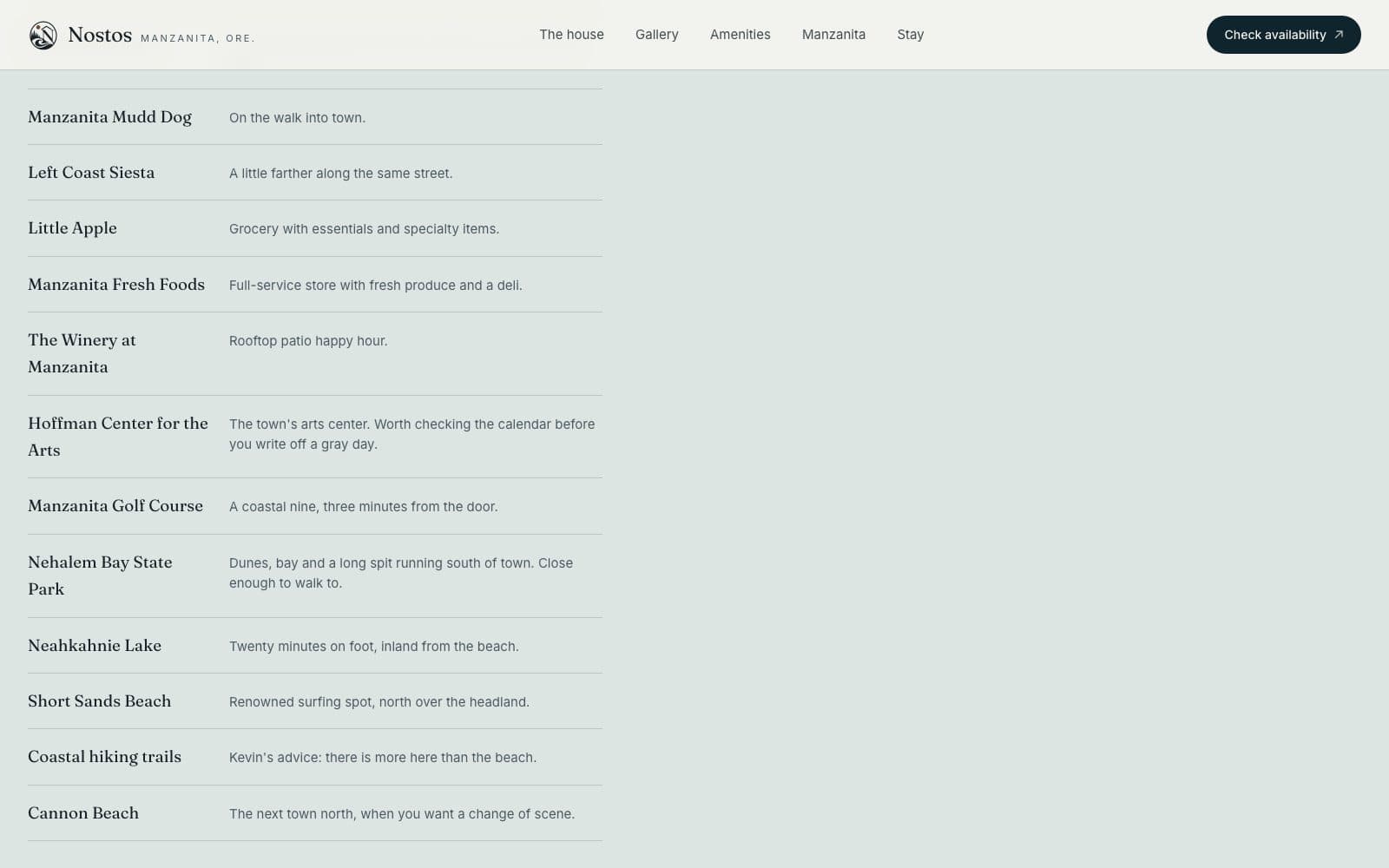
Kevin and Betsey wrote the Manzanita guide themselves, instead of padding it with copied tourism text. Walk and drive times come from the listing, and the simple map of the block is drawn from mapped data, not sketched.
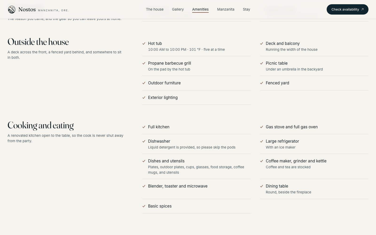
A path to booking that wasn't there before
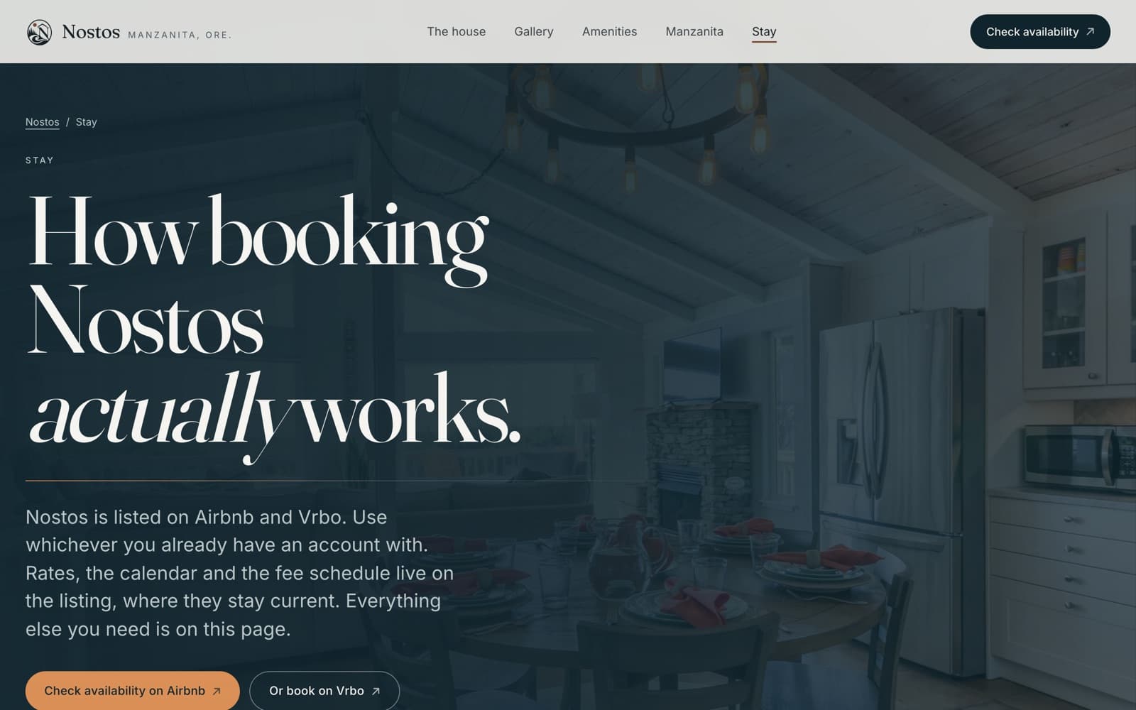
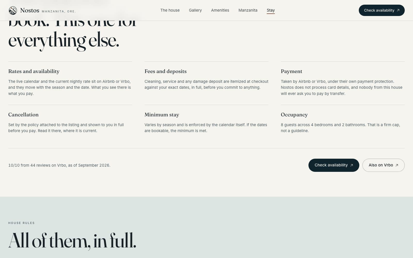
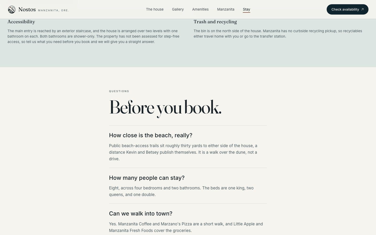
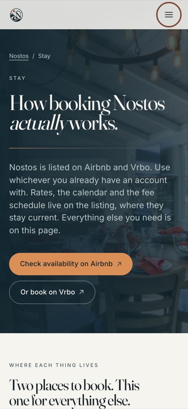
Stay gathers everything a guest needs before committing: how many it sleeps, the beds, where rates are published, house rules, check-in and check-out, and the two live listings. Where the old guide and the current listing disagreed, the listing wins, and the difference is stated, not hidden.
Check availability sits in the header on every page, and comes back wherever someone is likely to decide. It's one action, not five competing ones.
The guide, preserved
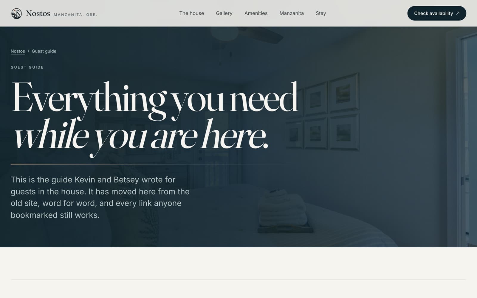
The old site's real value was its guest guide, written by the owners over years of hosting. It's kept word for word under /guide, reorganized so a guest standing in the kitchen at 9pm can find the hot tub instructions in one step.
All ten old web addresses redirect, so bookmarks still work and the search value the old pages had carries over.
Mobile is where this gets booked
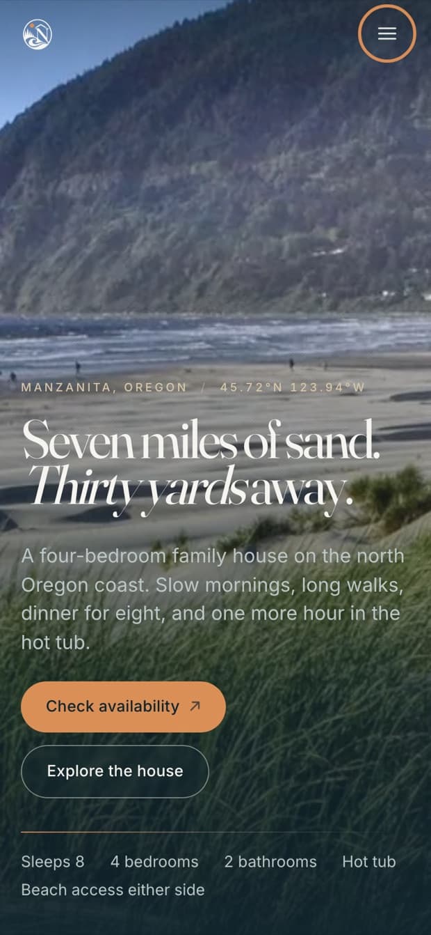
Vacation rentals get chosen on phones, often in bed. So the phone layout was designed on its own, not just squeezed down: the headline keeps its line breaks, photos crop to tall frames instead of shrinking into strips, and Check availability stays within thumb reach.
Goals, not results yet
What this is designed to change
The site launched recently, and the owners haven't shared any analytics with us since. So instead of borrowing numbers, here's what the rebuild was designed to change. You can check each one against the live site today.
- A prospective guest can see the property, the rooms and the beach before deciding.
- Availability and booking are reachable from every page, through the owners' existing Vrbo and Airbnb listings.
- The guest guide the owners wrote is kept, reorganized, and still answers the questions it always did.
- Ten old web addresses redirect, so existing links and search value survive the move.
- Every published fact traces back to the listing or to the owners' confirmation, with conflicts written down.
Nostos didn't need to be made prettier. It needed the half of its website that had never been built, and it needed that half to arrive without breaking the half that already worked.
Still open
- Post-launch analytics from the owners, if they choose to share them.
- The owners still need to settle the check-out time and hot-tub fee, which differ between the kept guide and the live listing.
What we did
Is your site doing the same thing to you?
We can look at your site the way we looked at Nostos Beach House’s, and tell you what we find before anyone designs anything.
Start a transformation