
The box you can actually build, instead of the one you had to describe.
Rebuild in progress · current site still liveScreens below are development captures, not a published site.
A brochure with an email form becomes an owned storefront: a box builder that counts squares as you fill it, an order that exists as a record rather than an inbox, and an admin the family runs the business from.
Client
Sweet Squares
Sector
Local food · Dessert bakery
Where
Greater Houston, Texas
Engagement
Storefront rebuild plus ordering and operations platform
Year
2026
Services
Experience and technical audit · Commerce modelling · Storefront design and build · Box-builder interaction · Checkout and order lifecycle · Owner admin and fulfilment · Inventory and availability · Accessibility and performance passes
A dessert business that sells boxes of squares had no way for a customer to say what goes in the box.
Every order arrived as email. Nothing was recorded, so nothing could be looked up, counted, or reconciled.
Published rules the site had no machinery to apply: a delivery area nothing checked an address against, and a free-delivery offer with no fee, minimum or threshold anywhere in the code.
Before — a menu you could read and an order you could only describe
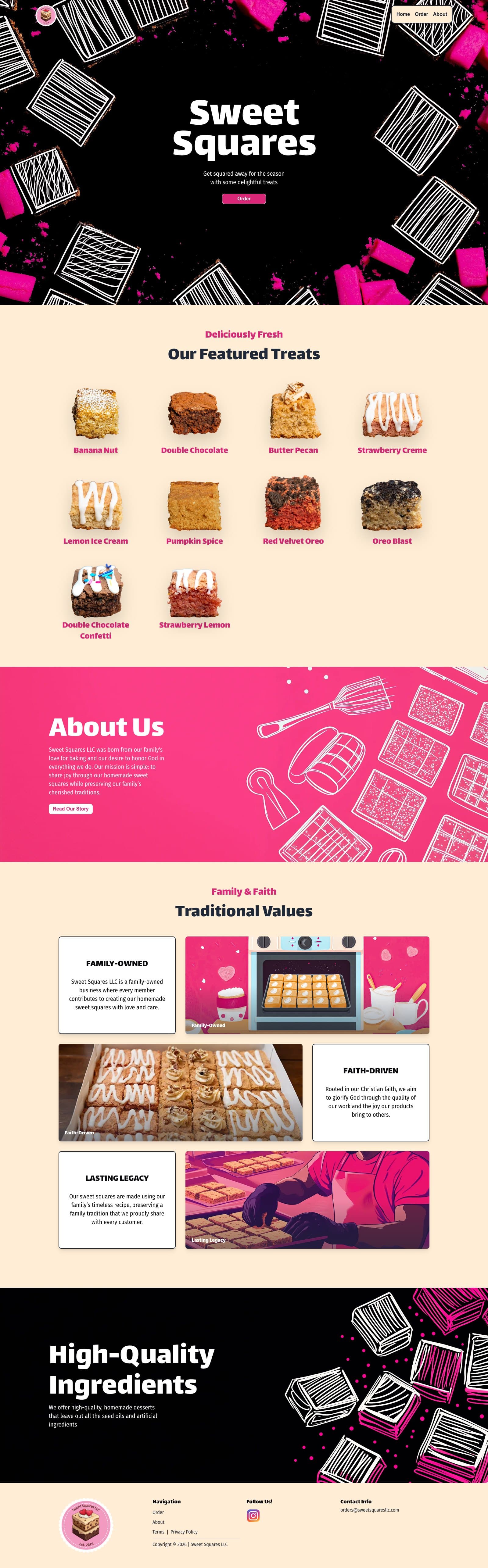
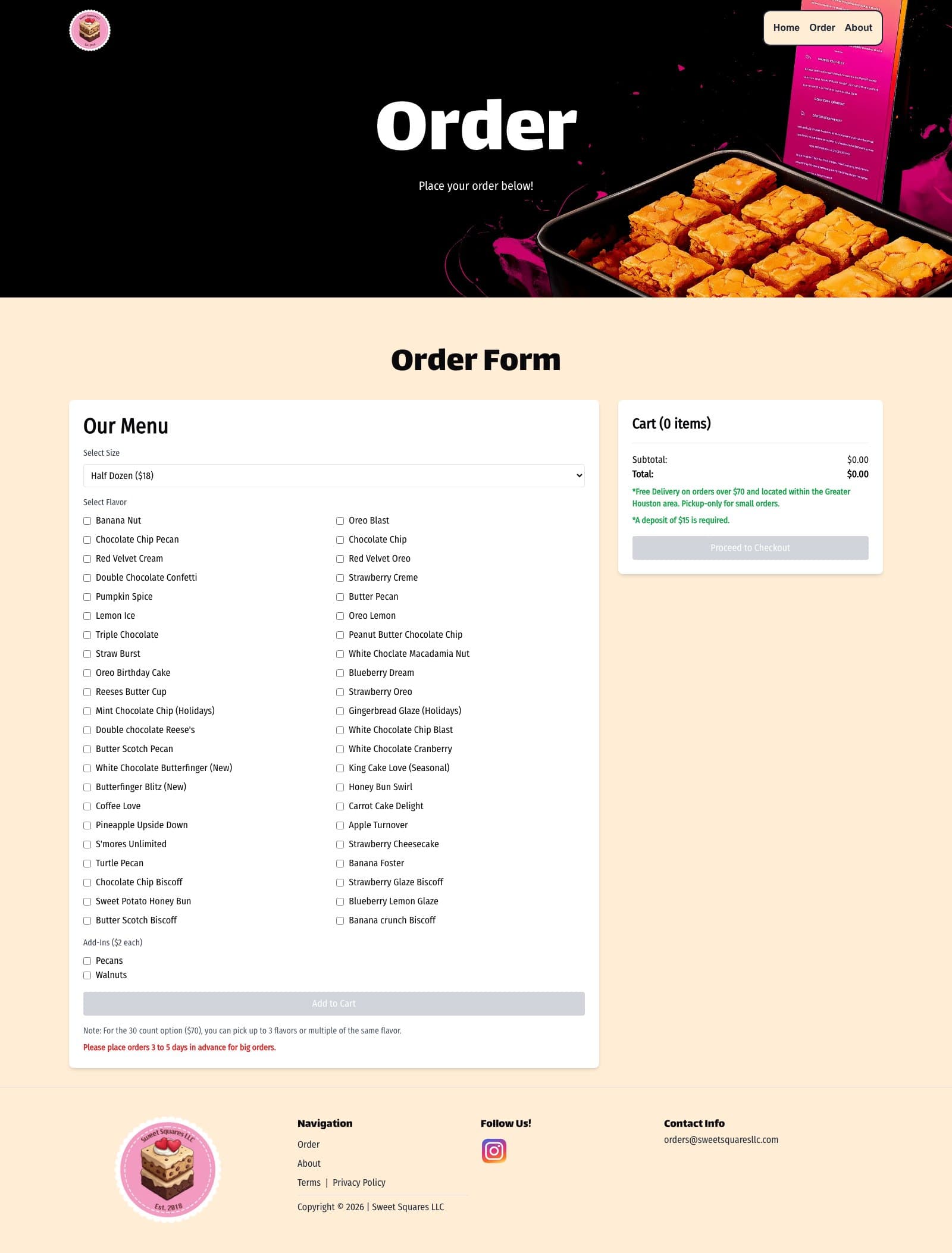
The current site is nineteen presentational components and a single data file: forty-four flavour names, three box sizes, two add-ins, hard-coded. An order leaves the browser as two EmailJS templates. Nothing is recorded, nothing is priced by the system, and no payment is taken — the checkout offers Cash App, Venmo and Zelle handles as radio buttons.
Still live at sweetsquaresllc.com while this is built. The design is competent and the copy is the family's own; the problem is entirely underneath.
The order page is the whole business in one screen: a size dropdown, forty-four checkboxes, two add-ins, and a cart that adds up in the browser before emailing itself somewhere. Read the small print in the panel on the right and you are reading the contradictions — a $15 deposit beside a terms page that requires payment in full.
Before
The current homepage, captured in full.
Before
The order page. Forty-four checkboxes, a browser-side total, and an email — with the deposit and delivery rules in the panel beside it.
What the audit found
Read against the source as well as the published pages, because the commerce rules only exist in the code. Every line below is quoted from a page that is public today.
01
The thirty-count box could not be specified
The rules say you may pick up to three flavours “or multiples of the same flavour.” The code sends three names and a price. How many of each was a thing the site could say and not a thing a customer could choose.
02
An order is an email, not a record
Two templates go out, one to the owner and one to the customer. There is no order to look up, no status to check, and no way to know what was promised once the inbox scrolls. A failed send lost the order silently — the customer's confirmation still said it had worked.
03
No payment, only a handle
Cash App, Venmo and Zelle are offered as radio buttons. The transaction happens somewhere else, later, and reconciling it is manual.
04
Prices were computed in the browser
Box rules and totals were worked out in the page and then emailed. A modified page could have ordered anything at any price, and nothing on the receiving end would have known.
05
The site contradicts itself about money
The order page requires a $15 deposit. The terms page says payment must be made in full at the time of purchase. Both are published, today.
06
And about where it delivers
The order page says Greater Houston only. The terms page says “we ship within the United States only.” A customer in Dallas cannot tell which applies to them.
The strategic idea
Make the box the interface.
Everything else on the old site was legible. The failure was concentrated in one place: the moment a customer decides what they are buying. Forty-four flavours and three box sizes is a genuinely interesting choice to make, and the old site turned it into a form.
So the box builder is the centre of the rebuild. Pick a size, choose flavours, watch the squares fill, and see exactly how many are left. The thirty-count rule the old site could only describe — up to three flavours, multiples allowed — is now something you do rather than something you read.
Underneath it, the parts a family business actually runs on: an order that exists as a record, inventory that can mark a flavour sold out, a pickup slot that reflects real hours, and an admin the owner operates without calling anyone.
Today, and what replaces it
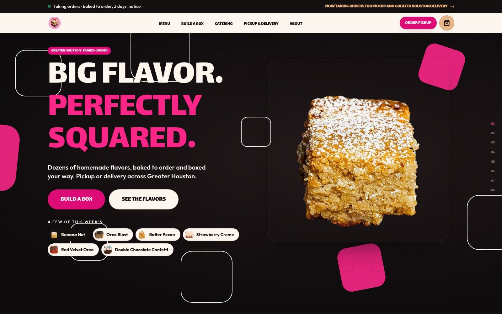
The same page twice: Sweet Squares’s site as it is serving customers right now, and the rebuild it is being replaced by. Drag the control, or focus it and use the arrow keys.
The rebuild has not launched. Everything on the right is a development capture, and nothing on it is published.
Live todayIn development
Live todayThe current homepage, captured in full.In developmentRebuild homepage, in development. Not yet published.
The box builder
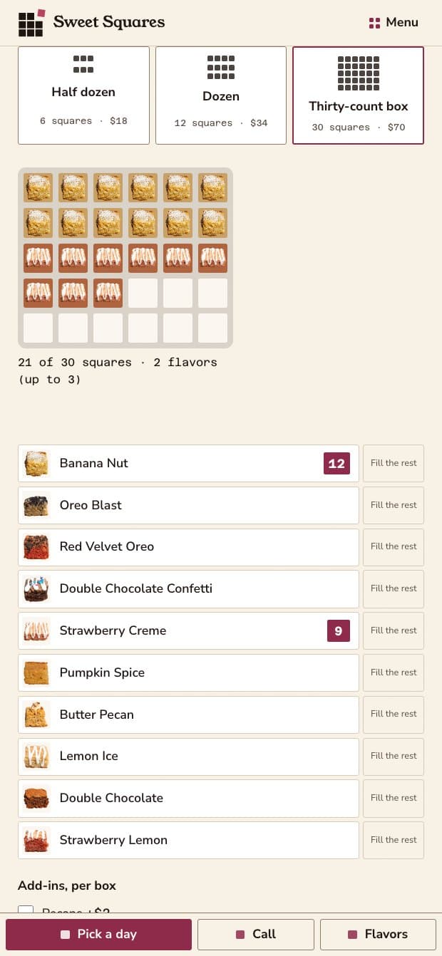
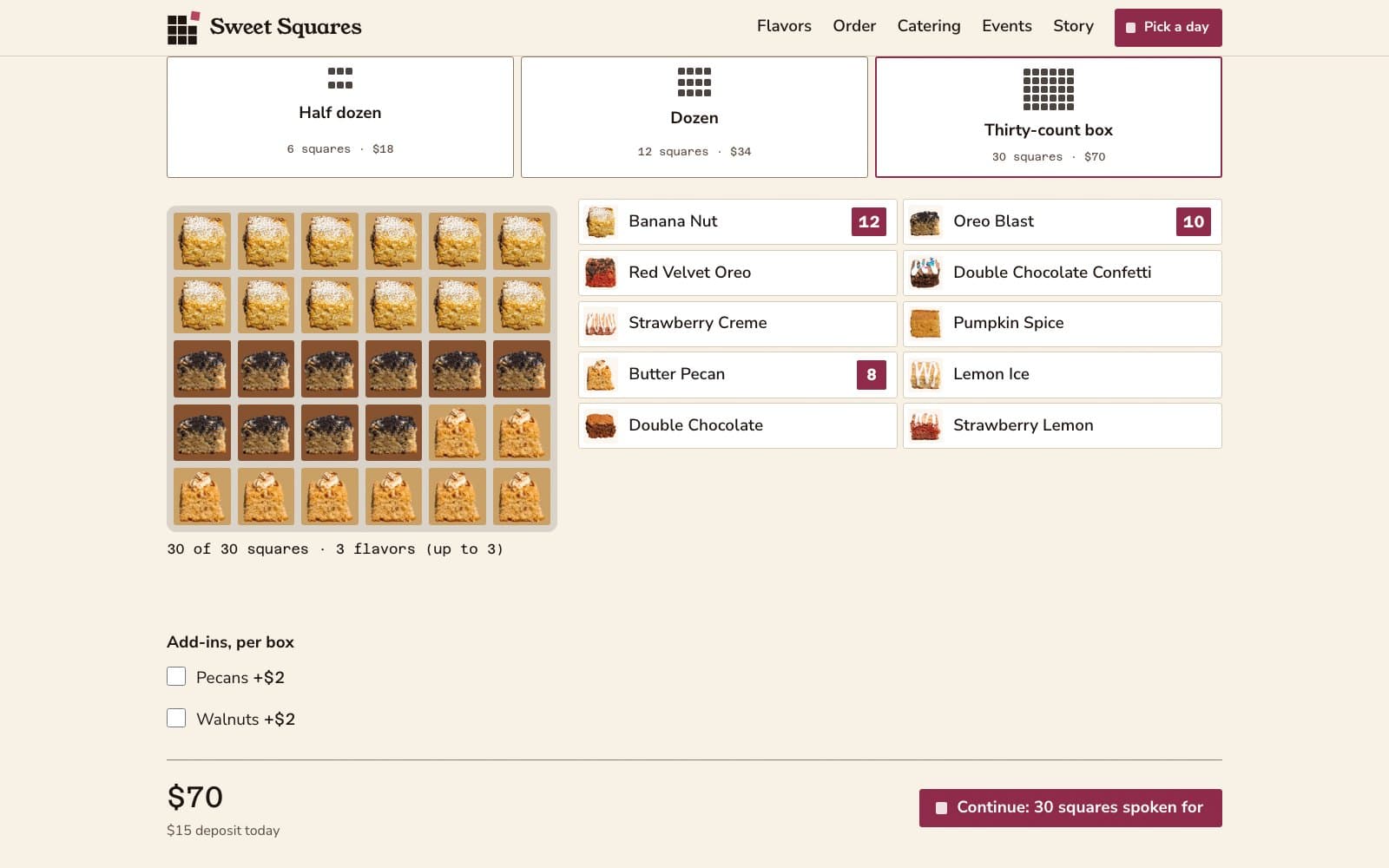
Pick a size and the squares appear empty. Choose a flavour and they fill with photographs of the actual squares. The counter says how many are left, which is the sentence the old site could not write.
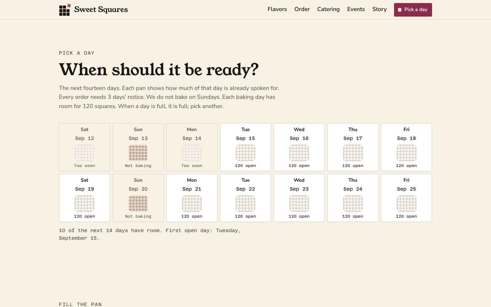
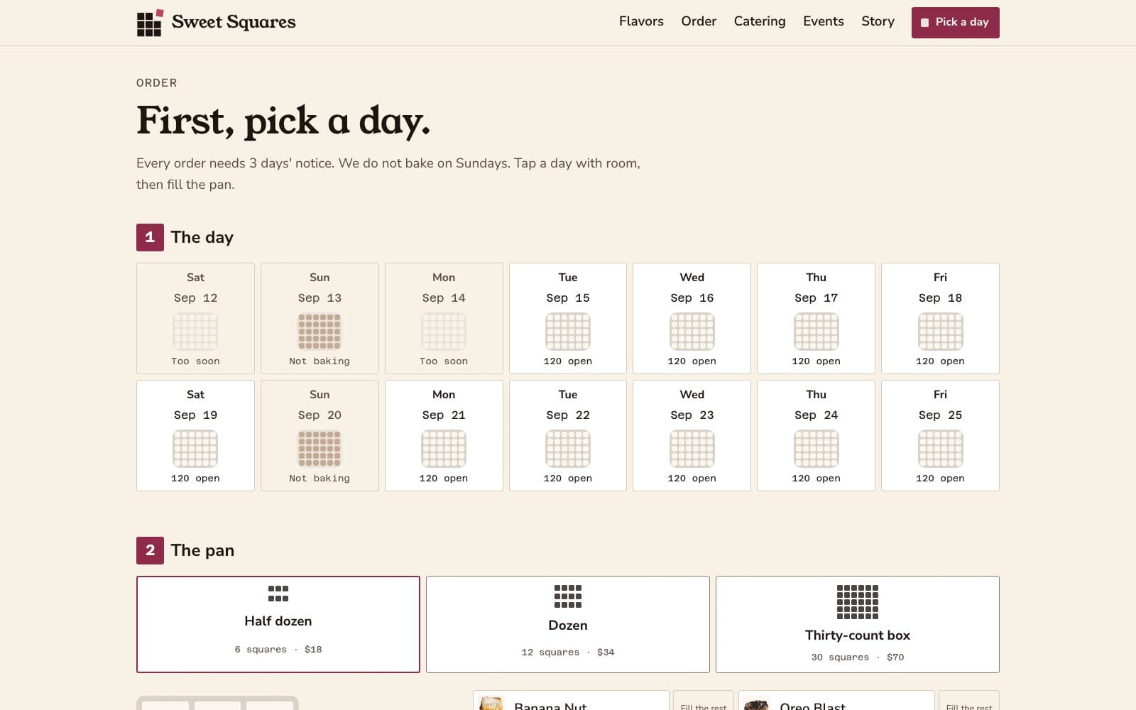
Choosing a size states the constraint that comes with it, where the choice is being made: the thirty-count needs five days' notice, and the checkout calendar will only offer dates the kitchen can hit.
Two ways in, because an arcade-style tile grid is a pleasure for some people and an obstacle for others: a tile mode and a plain stepper list, both keyboard operable and both producing the same order.
In development
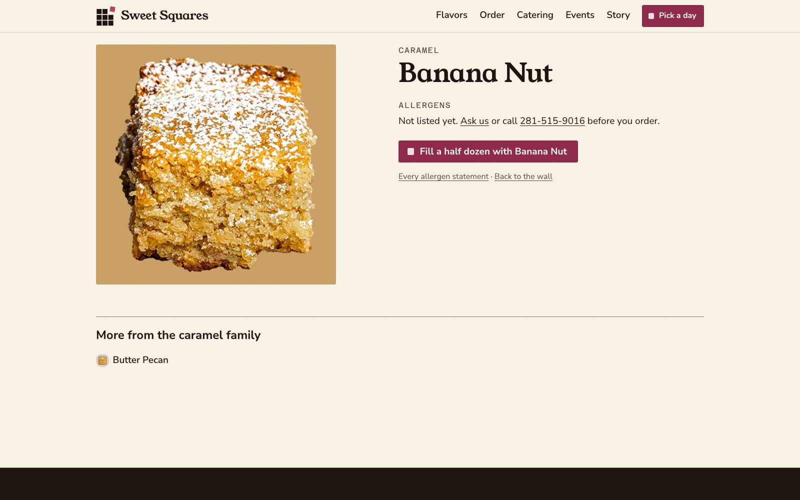
Twelve Banana Nut, ten Oreo Blast, five Butter Pecan. Three still to go, and the panel says so.
In development
Multiples of the same flavour, specified rather than implied. Choosing a flavour turns its tile into a stepper.
The menu, and the correction the owner made
The menu opened on Featured — six of the forty-four flavours — under a heading reading “Menu” and an eyebrow reading “The whole case.” The owner read that as the entire catalogue, which was the correct reading of what was on the screen.
So All flavors leads and is the default, every tab carries its count, and the row is labelled Filter. “All flavors 44” beside “Featured 6” states the size of the catalogue without needing a sentence. The counts then made the strip wide enough to clip its last two categories behind the search box, so it wraps — a filter whose last two options are hidden is the same failure being fixed twice.
In development
The menu, after the correction. Every tab says how much is behind it.
In development
Thirty of forty-four, and still going. Availability is per flavour and reflects what the kitchen has.
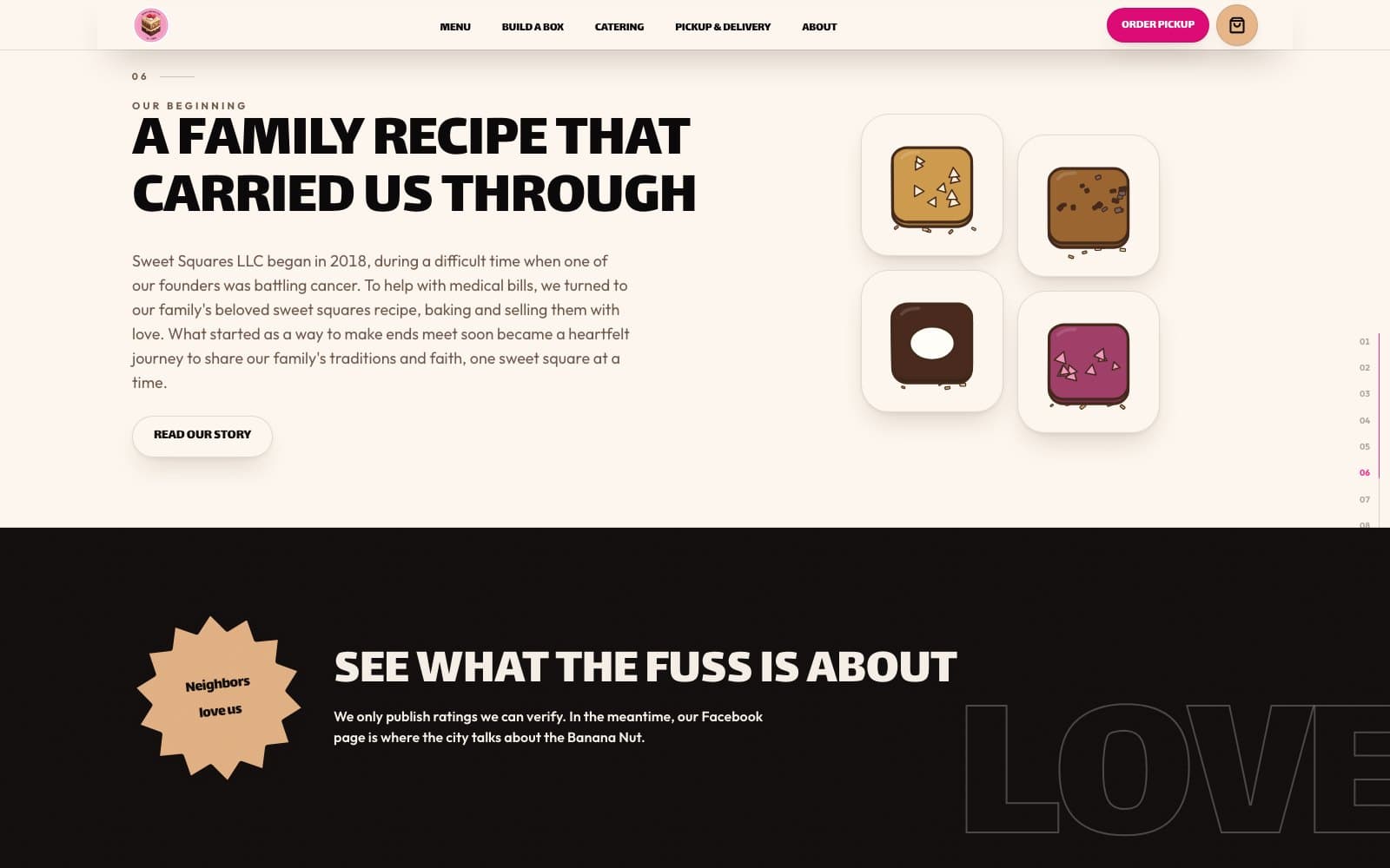
The homepage, as eight chapters
The first build of this page was decorated rather than designed: handwriting eyebrows on every section, a mascot with a homepage slot of its own, rotated pills in four colours the brand does not use, a sprinkle trail following the cursor, and icing drips closing four sections. Each was defensible alone. Together they read “candy arcade”, and they were louder than the food.
All of it came out, and the budget went into motion instead. The page is now an argument in eight numbered chapters — the lineup, the pan, the box, the kitchen, every flavour, the story, pickup and delivery, and the close — with one drizzle line poured down the left gutter to connect them.
The order is the argument. “Fill the box” used to sit above “Cut from the pan”: the reader was asked to fill a box before being shown the product being made. The cut comes first now.
In development
01 — Today's lineup. Six cards, each one orderable from where it stands.
In development
02 — Cut from the pan. A scrubbed set piece: the pan cuts into twelve as you scroll.
In development
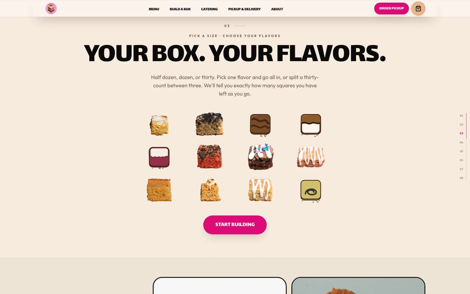
03 — Fill the box. The old section asserted “watch it fill” in a paragraph; this one does it, twelve squares at a time.
In development
08 — The close. The page used to end on a newsletter field; it now ends on a statement and an action.
The photo wall, and what “gross” turned out to mean
The owner said chapter four was “not to the standard of the rest of the homepage.” They were right, and none of the three causes was the photography.
Every cell was cropped to 4:3. Every photograph the family has uploaded is square — 676 by 676, 525 by 525 — so the crop discarded the top and bottom eighth of each one, and a parallax drift then moved that crop window around as the section passed. A photograph of an open box was being shown as a band of empty white lid above a stripe of magenta cardboard, with the squares it is a photograph of squeezed into the bottom third. The component had been given each photo's real dimensions since the day it was written and had never read them.
The wall keeps a square module, because a wall is a grid and a grid needs one brick. Below four photographs the section becomes a different composition rather than a stretched one.
In development
04 — From our kitchen. The family's own photographs, shown at the shape they were taken in.
In development
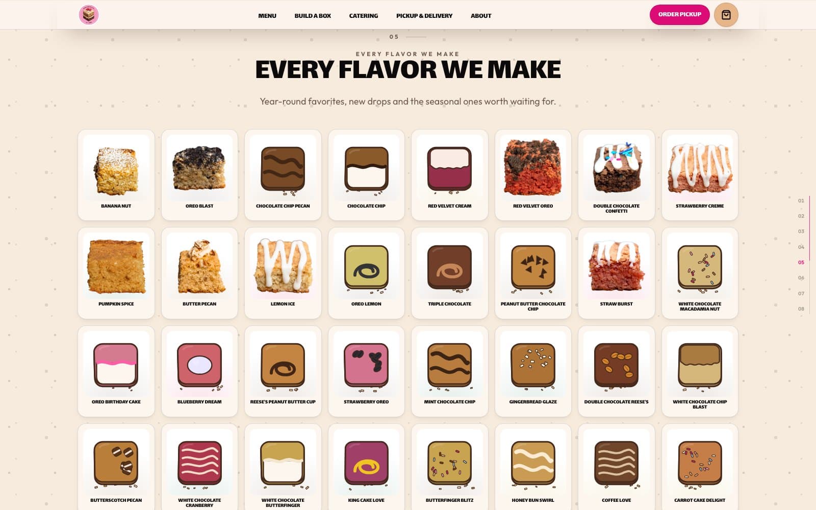
05 — Every flavour we make. Four rows, counter-scrolling, on the same square module.
The pass that went looking for defects
Twelve public and twenty-three admin pages, crawled at two viewports, collecting metadata, heading order, unnamed controls, overflow sampled down the whole scroll, and console errors, then every internal link followed.
Most of it was already right: one h1 per page across all thirty-five, no skipped levels, no duplicate ids, no missing alt text, and zero horizontal overflow anywhere. Twenty-one things were not.
Two canvases that never stopped drawing
The homepage scroll was reported as clunky. It was, and measurably: on a production build the median frame took 50ms and 64.9% of frames exceeded 32ms.
The cause was not the animation. Both 3D canvases were rendering continuously by default, and this page mounts two of them on a document fourteen thousand pixels tall. A profile taken with the reader in the footer — both canvases thousands of pixels off screen — still showed the hero rendering at sixty frames a second.
Confirmed rather than assumed, because a headless browser software-renders 3D and a slow number there proves nothing on its own: the menu and about pages were measured in the same harness as controls and both scrolled flat at 17ms. The home page was the outlier, and the jank persisted in the bands where no canvas is on screen.
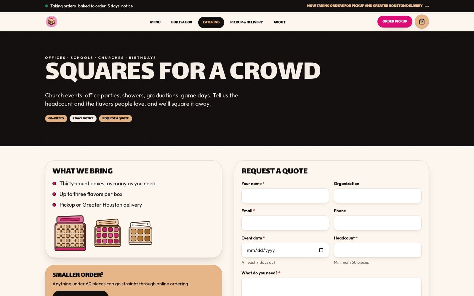
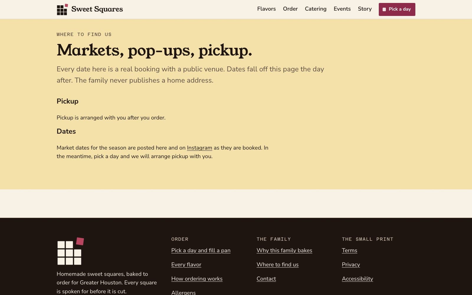
Catering, delivery, and the things people phone to ask
The old site answered these in two places that disagreed. Each now has a page, and the answers come from settings the owner controls rather than from copy nobody remembers editing.
The delivery ZIP check is on the homepage as well as its own page, because “do you come to me” is the question that decides whether the rest of the site is worth reading.
In development
07 — Two ways to get your box, with the ZIP check where the question gets asked.
In development
Catering, as an enquiry with the questions already asked.
In development
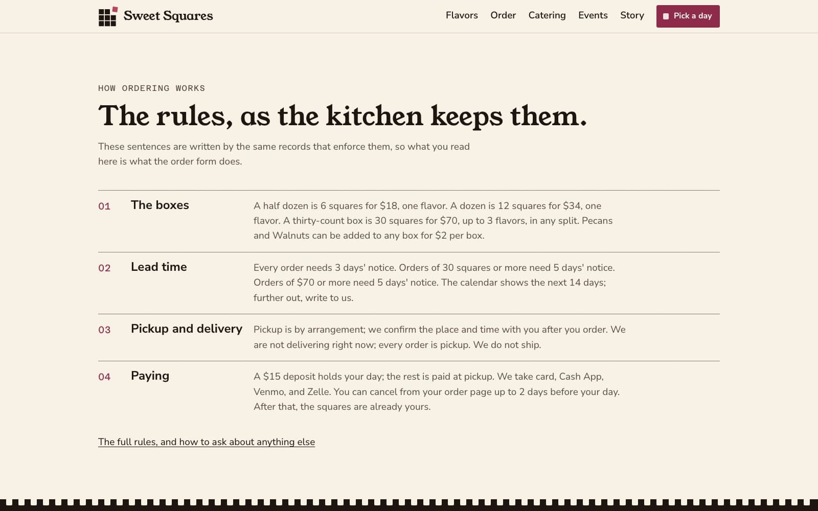
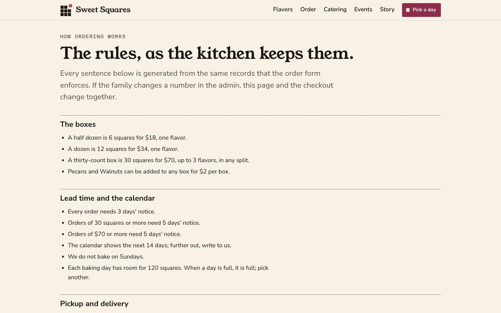
One page, one answer each. The notice period comes from a setting, not from copy.
The parts that were already right
A rebuild is not an argument that everything before it was wrong. The origin story, the values and the product photography are the family's, they are good, and they are why the old site read as a real business rather than a template. They move across intact — as content the owner can edit, rather than as copy baked into a component.
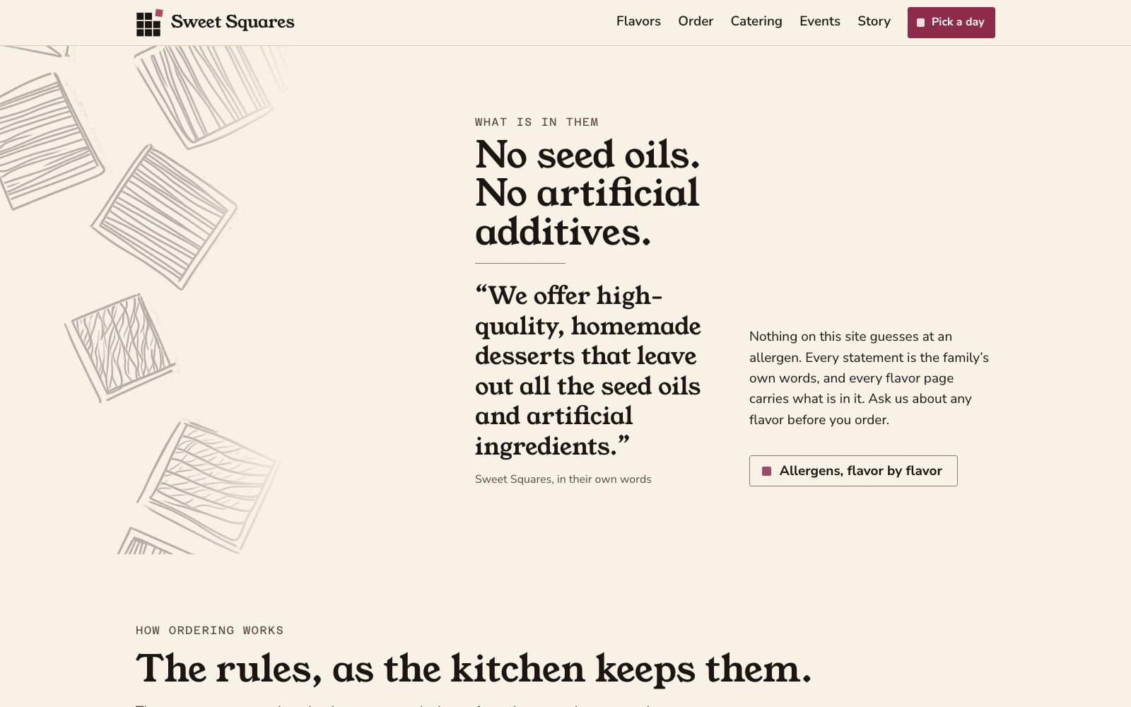
The allergen page is new, and is the kind of page a food business needs before it needs anything clever. So is the line under the reviews heading: we only publish ratings we can verify, and there are none yet, so the section says so rather than inventing five stars.
In development
06 — The family's own words, unchanged. Below it, a reviews section that declines to invent any.
In development
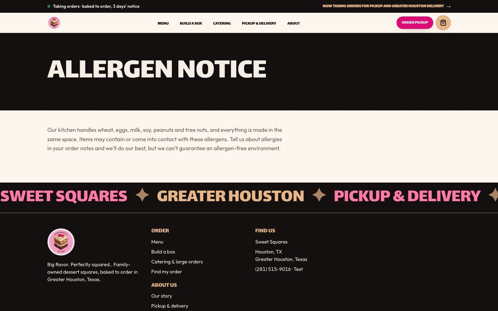
Allergens, stated plainly, including what a shared kitchen cannot guarantee.
In development
The story and the four values, now editable without a developer.
On a phone
Most of these orders are placed on a phone. The box builder is the part that had to survive the move, and it is the part that was designed for it first — the size cards stack, the notice period stays attached to the size that needs it, and the counter follows the choosing rather than sitting above it.
In development
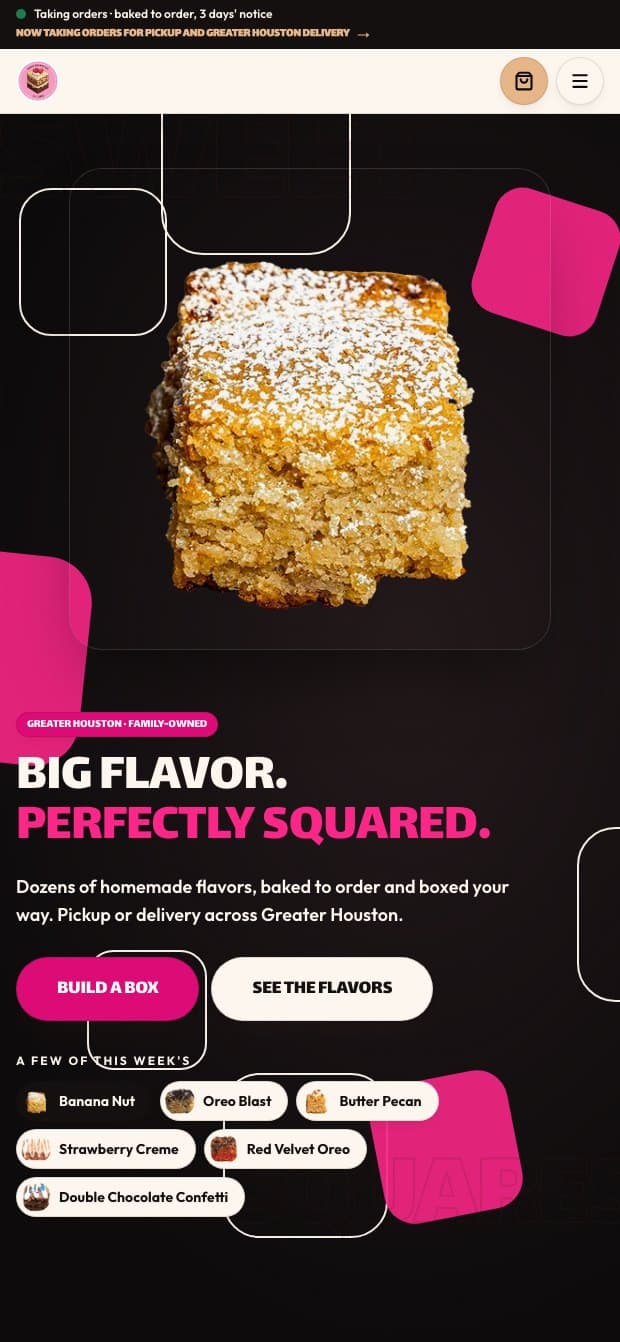
Homepage, 390px.
In development
The builder on a phone. The notice period sits with the size that needs it.
In development
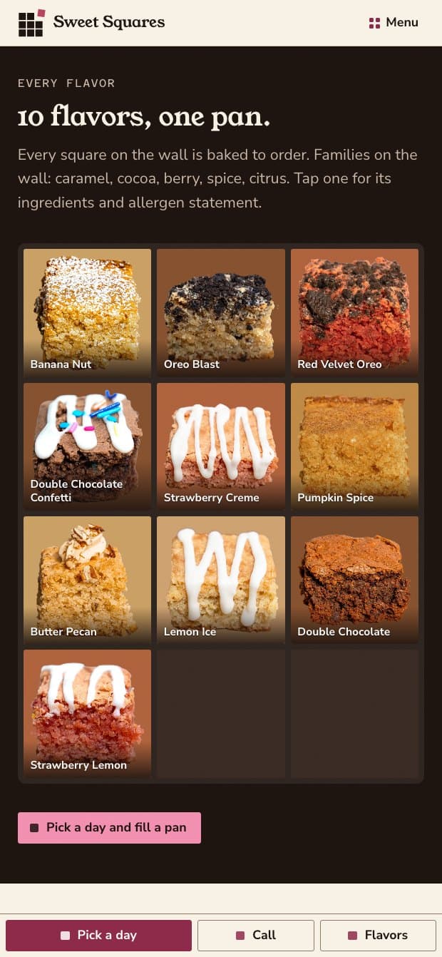
Menu, 390px.
Intended outcomes — not results
What this is designed to change
The rebuild is in development and none of the customer-facing outcomes below have been measured — there are no customers on it yet. The scroll performance figures in the chapter above are measured, on a production build, and are the exception.
A customer can specify exactly what goes in a thirty-count box, including multiples of one flavour.
Every order exists as a record with a status the customer can check, rather than as two emails.
Prices and box rules are computed on the server, so a modified page cannot order anything at any price.
The owner can mark a flavour sold out without calling anyone.
Deposit, payment, delivery area and shipping are stated once, from settings, rather than contradicting each other across two pages.
The family's own photography, values and origin story carry over as content the owner can edit.
The old site was not badly made. It was made to describe a business rather than to run one, and the difference only shows at the moment somebody tries to buy something.
Still open
The published contradictions — the $15 deposit against payment in full, and Greater Houston against shipping within the United States — are quoted back to the owner and remain unresolved.
The delivery area needs real ZIP codes, a fee, a minimum and a free-delivery threshold before the rules on the page can be enforced by the site.
The governing-law placeholder on the terms page needs a real jurisdiction before launch.
Payment provider not yet chosen; the build runs against a demo adapter.